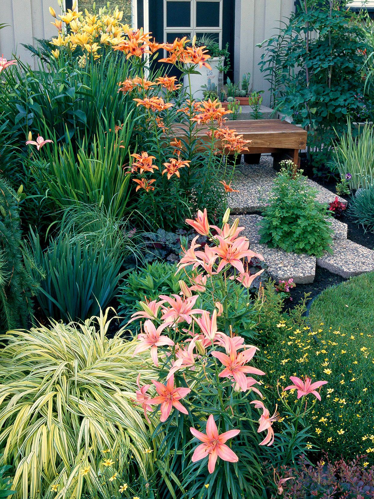
If your garden has ever looked like a rainbow exploded (fun, but confusing), you’re not alone. Plants are sold one
gorgeous bloom at a timeso it’s easy to end up with a “collection” instead of a “design.” The fix isn’t expensive,
complicated, or locked behind a landscape architect’s secret handshake. It’s a simple color wheel.
A color wheel helps you pick flower and foliage colors that look intentional, whether you want calm and classy,
bright and energetic, or bold enough to make the neighbors “accidentally” walk slower past your house. In this guide,
you’ll learn how to use color theory without turning your yard into a science fair posterplus practical plant
examples, layout tips, and a real-world planning method you can repeat every season.
Why a Color Wheel Works in the Garden (Even If You “Don’t Have an Eye for Color”)
The color wheel is basically a map of relationships between colors. Instead of guessing which flowers “go together,”
you choose a color scheme that naturally creates harmony or contrast. That means fewer impulse buys that clash and
more planting combos that look like you planned them on purpose (even if you definitely did this at midnight with a
snack).
Garden color is more than flowers
Color in a garden comes from:
- Blooms (obviously)
- Foliage (chartreuse, burgundy, silver, blue-greenhuge impact)
- Stems and bark (red twig dogwood, cinnamon stems, dark canes)
- Hardscape (mulch, stone, pots, fences, furniture)
- Light (full sun punches up color; shade softens it)
When you plan with a color wheel, you’re not just choosing flower colorsyou’re building a palette that can carry
through the whole season, even when some plants aren’t blooming.
Quick Color Wheel Basics for Gardeners
Primary, secondary, and in-between colors
On a standard color wheel:
- Primary colors: red, yellow, blue
- Secondary colors: orange, green, purple (made by mixing two primaries)
- Tertiary colors: the “between” shades (like red-orange or blue-violet)
Color temperature: warm vs. cool
Warm colors (reds, oranges, yellows) feel lively and attention-grabbing. Cool colors (blues, many purples, and
blue-greens) feel calmer and often “recede,” making a space seem a bit larger. That’s not just artsy talkit’s a
real design trick you can use to manipulate the feel of your yard.
Value and intensity: the secret sauce
Two gardens can use “purple and yellow” and still look totally different depending on:
- Value: light vs. dark (pale lavender vs. deep violet)
- Intensity (saturation): bright jewel tones vs. muted dusty tones
This is how you avoid the “highlighter aisle” effect. If you want bold color, keep the shapes simple. If you want
complex mixes, soften intensity with whites, silvers, blues, or lots of green foliage.
Step-by-Step: How to Use a Color Wheel to Plan Your Garden
Step 1: Decide the garden’s job (vibe first, flowers second)
Ask what you want this space to feel like:
- Relaxing retreat: cool or analogous schemes, softer intensity, plenty of green
- Party patio: warmer colors, higher contrast, brighter accents near seating
- Front yard “wow”: complementary or triadic schemes, bold focal points near the entry
- Small yard that feels bigger: cooler colors toward the back, warm accents up front
Step 2: Choose a color scheme from the wheel
Pick one approach and stick to it. Here are the most garden-friendly options:
| Scheme | What it looks like | Best for |
|---|---|---|
| Monochromatic | One hue + its tints/shades | Elegant, cohesive beds; small spaces |
| Analogous | Neighboring colors | Easy harmony; cottage gardens; borders |
| Complementary | Opposites on the wheel | High-impact color pops; focal points |
| Split-complementary | One color + the two colors next to its opposite | Contrast without looking chaotic |
| Triadic | Three evenly spaced colors | Playful, balanced, “designer” look |
Step 3: Pick a “dominant” color, then supporting colors
A helpful rule: treat your palette like an outfit. One color is the main character, the others are supporting cast.
If everything is a lead actor, you get dramaand not the fun kind.
- Dominant color: the big recurring hue (often 50–70% of the visual color)
- Secondary color(s): repeat in smaller doses (20–40%)
- Accent color: sparingly for “spark” (5–10%)
Step 4: Build your plant palette (blooms + foliage + “neutrals”)
You can keep a scheme from getting loud by adding neutrals and foliage buffers:
- White flowers: brighten, link colors, calm high contrast
- Silver foliage: acts like a “cool neutral” (dusty miller, artemisia)
- Dark foliage: adds depth and makes bright blooms pop (heuchera, coleus)
- Green: the ultimate peacekeeper; don’t underestimate it
Step 5: Plan by season (because flowers have schedules)
A color plan that looks amazing in May can flop in August if half your palette finished blooming. The fix:
- Choose “anchor plants” with long color presence (foliage color, long bloomers, shrubs)
- Layer bloom times (spring bulbs, early perennials, summer performers, fall finishers)
- Use containers as “seasonal swap stations” to patch color gaps
Color Schemes That Actually Work (With Specific Examples)
1) Monochromatic gardens: one color, lots of depth
Monochromatic doesn’t mean boring. It means you play with value, texture, and flower shape while staying in one hue.
Think “blue garden” with pale sky blues, medium periwinkles, and deep indigosplus blue-green foliage.
Example palette: Purple monochrome
- Lavender or catmint for soft purple haze
- Salvia in rich violet spikes for structure
- Alliums or verbena for round pops
- Dark-leaved heuchera to deepen the look
- White alyssum as a gentle “pause button”
Pro move: repeat the same purple in at least three places. Repetition is what makes a color plan feel
intentional.
2) Analogous schemes: the easiest way to look “put together”
Analogous colors sit next to each other on the wheellike yellow, yellow-orange, and orange. These schemes feel
naturally blended, which is why they’re a favorite for borders and cottage-style planting.
Example palette: Sunset border (red → orange → yellow)
- Red zinnias or dahlias as bold anchors
- Orange marigolds or calendula for continuity
- Yellow coreopsis or black-eyed Susans for bright lift
- Bronze or chartreuse foliage (coleus) to bridge tones
This palette looks especially good in late afternoon lightbasically the “golden hour” of gardening.
3) Complementary schemes: high contrast, high energy
Complementary colors sit opposite each other on the wheellike purple and yellow, or blue and orange. They’re
naturally attention-grabbing, so they’re perfect for focal points: near entries, at the end of a path, or around a
mailbox that deserves a glow-up.
Example palette: Purple + yellow
- Purple salvia, lavender, or catmint
- Yellow yarrow, coreopsis, or bidens
- White flowers to soften transitions
- Green or silver foliage to keep contrast crisp
Design tip: Instead of scattering colors evenly like confetti, mass them in drifts. Big blocks of purple
next to big blocks of yellow look cleaner and more modern.
4) Split-complementary: contrast without the “neon sign” vibe
Split-complementary uses one main color plus the two colors adjacent to its opposite. For example, if your main
color is blue, instead of pairing it with straight-up orange, you’d use yellow-orange and red-orange. It keeps the
energy but feels more forgiving.
Example palette: Blue with warm accents (blue + yellow-orange + red-orange)
- Blue: salvia, ageratum, blue lobelia (containers)
- Yellow-orange: calendula, some marigolds, rudbeckia tones
- Red-orange: zinnias, dahlias, lantana
5) Triadic schemes: bold, balanced, and surprisingly “designer”
Triadic means three colors spaced evenly around the wheellike red, yellow, and blue. This can look playful and
lively, but it works best when you choose one dominant color and keep the other two as accents.
Example palette: Classic primary triad (with a grown-up twist)
- Dominant: blue (cooling base; feels cohesive)
- Accent 1: yellow (small bright sparks)
- Accent 2: red (very selective focal dots)
- Neutral: white + lots of green
Pro-Level Tricks (That Don’t Require Pro-Level Stress)
Use warm and cool colors to “move” your garden walls
Want your yard to feel deeper? Put cooler colors toward the back and warmer colors closer to viewing areas. Cool
tones visually recede; warm tones advance. It’s like forced perspective, but with flowers instead of a movie set.
Match the garden palette to the house and hardscape
If your house is warm-toned brick, a cool-heavy palette (blues, purples, silvers) can be a gorgeous contrast.
If your house is cool gray, warm gardens can add welcoming energy. Also: consider the color of your mulch, gravel,
fences, and containersthose are permanent background colors, and your plants are the seasonal wardrobe.
Repeat, repeat, repeat (the secret to “intentional”)
A single purple flower in one corner looks like an accident. That same purple repeated three to five times looks
like design. Repetition is the difference between “I planted stuff” and “I curated a living palette.”
Texture can rescue a simple color scheme
If you love monochrome or analogous schemes, make sure you vary:
- Flower shapes (spikes, daisies, umbels, balls)
- Leaf size (fine grasses vs. broad hostas)
- Plant height (layers create depth)
Shade gardens: let foliage be the star
Shade tends to soften flower color, so foliage color matters even more. Think chartreuse hostas, silver brunnera,
dark heuchera, variegated leaves, and pops of white blooms to brighten. In deep shade, white and pale blooms can
read as “glow.”
A Simple Planning Method You Can Do in One Afternoon
- Print a color wheel (or pull one up on your phone).
- Pick a scheme (monochrome, analogous, complementary, split-complementary, or triadic).
- Choose your dominant color based on vibe and existing hardscape.
- List 5–8 plants that fit your sun/shade conditions in those colors (include foliage plants).
- Assign roles: anchors (long season), fillers (medium), accents (short and punchy).
- Sketch drifts: big blocks, not scattered singles.
- Check bloom timing: make sure your palette shows up across the months you care about.
- Leave room for editing: gardens evolve. That’s the point. (Also, plants sometimes have opinions.)
Mistakes to Avoid (So Your Garden Doesn’t Look Like a Clearance Rack)
1) Too many “main” colors
If every color is equally loud, nothing stands out. Pick a scheme, pick a dominant hue, and let the rest support it.
2) Ignoring foliage and background
Flowers come and go. Foliage is your year-long canvas. Also, your mulch color and fence color can dramatically
change how blooms read.
3) Scattering single plants instead of massing
One plant here and one plant there looks random. Drifts and clusters look designed. If you want “natural,” think
sweeping repetition, not isolated sprinkles.
4) Forgetting the viewing distance
What looks subtle up close can disappear from the patio. If the bed is viewed from far away, use stronger blocks of
color or larger flower forms for readability.
Conclusion: Let the Color Wheel Do the Heavy Lifting
Planning your garden with a color wheel is the fastest way to upgrade from “pretty plants” to “pretty design.”
Choose a scheme, pick a dominant color, use foliage and neutrals to keep things balanced, and repeat your palette
across the space. The best part? You can keep your style flexible: swap annuals, rotate containers, and adjust each
season without losing the overall look.
And if you ever feel stuck, remember: nature already does color theory all day. You’re just borrowing the method.
Real-World Experiences: What Gardeners Learn After Using a Color Wheel (About )
Once gardeners start using a color wheel, the first “aha” moment usually happens at the garden center. Instead of
grabbing whatever bloom looks cutest under fluorescent lights, they begin shopping with a plan. People often say
they spend less money overallbecause they stop buying “random pretty” and start buying “pretty that fits.” It’s
not that impulse buying disappears (plants are persuasive), but it becomes more selective. The color wheel acts
like a tiny, honest friend in your pocket whispering, “Do you really need that hot-pink petunia in your calm blue
border?” Sometimes the answer is yes. But now it’s a deliberate yes.
Another common experience: gardeners realize foliage color is the real MVP. Early on, many people plan with flowers
only. Then summer hits, blooms fade, and the bed looks flat. The next season, they add chartreuse leaves to connect
yellow flowers, burgundy leaves to deepen pinks and purples, or silvery foliage to cool down a blazing orange-red
palette. This is where gardens start looking “designed” even between bloom wavesbecause the palette isn’t only
flowers on a timer.
Gardeners also discover that complementary color schemes are powerfulbut best used thoughtfully. Many people try a
full bed of straight complements (like purple and yellow everywhere) and find it can feel intense. The tweak they
usually make is adding buffers: more green, more white, or repeating one color as dominant while using the other as
accent. That single change often turns “wow, that’s loud” into “wow, that’s crisp.” Split-complementary schemes
become a favorite for the same reason: they keep contrast but feel more relaxed.
Light is another lesson that shows up fast. Gardeners notice that bright colors can look stunning in shade but
almost harsh in full sun at noon. Meanwhile, soft pastels that look dreamy in morning light can wash out when the
sun is blasting. Over time, many gardeners start placing high-intensity color near areas they use in the evening,
choosing cooler palettes for spots meant to feel restful, and leaning on whites (or pale yellows) to “glow” in low
light. The color wheel gets them started, but observation finishes the job.
Finally, gardeners who stick with a color-wheel approach often describe a new kind of confidence. They’ll break the
“rules” on purposelike dropping one unexpected accent color into an otherwise harmonious schemebecause they
understand what the rule was doing in the first place. That’s the real win: the garden becomes personal without
becoming chaotic. And when someone compliments the yard, the gardener can smile and think, “Thanks. It was me…
and also a circle of colors doing most of the work.”