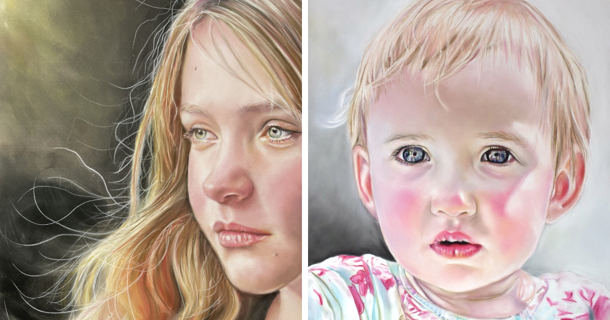
Some portraits tell you what a person looks like. The portraits I love most suggest what that person has survived, what they are hiding, or what they might say after everyone else leaves the room.
That is why I create emotive pastel portraits. I am not chasing flawless skin, perfectly symmetrical features, or the sort of smile people produce when someone points a camera at them. I am looking for quieter evidence of personality: a guarded mouth, a tired shoulder, a direct stare, or a hand resting in a way that reveals more than the face.
Pastel is ideal for this kind of work. It can be soft without becoming timid, colorful without turning decorative, and immediate without looking unfinished. One mark may feel like skin; the next may resemble light, dust, fabric, memory, or a small emotional thunderstorm.
Why I Chose Pastel for Emotional Portraiture
Pastel is made primarily from powdered pigment combined with enough binder to form a usable stick. Because the medium places pigment directly on the working surface, its colors can appear unusually luminous. Historically, that radiance helped pastel portraiture flourish, especially when artists wanted the scale and presence of an oil painting with a different kind of freshness and intimacy.
For me, the attraction is physical. I hold the pigment in my hand. There is no brush standing politely between me and the portrait. I can drag the side of a pastel across textured paper, sharpen a pastel pencil for a tiny eyelid adjustment, or press a broken fragment into the surface to create a broad, unapologetic mark.
Pastels are also wonderfully honest. A hesitant stroke looks hesitant. An energetic stroke looks energetic. If I fuss over an area for too long, the portrait usually tells on me. It develops the visual equivalent of someone who has been forced to smile through a three-hour family photo session.
Softness Does Not Mean Weakness
The word “pastel” is often used to describe pale, sugary colors, but pastel sticks can produce deep violets, hot reds, acidic greens, smoky neutrals, and nearly black blues. I may begin a face with lavender shadows, build warmth with coral and rust, then introduce turquoise or olive where reflected light changes the skin.
These colors are not random decorations. They allow me to describe emotional temperature. A cool shadow may create distance or stillness. A warm cheek beside a cool background can make the subject feel vividly present. A small slash of red near the eye may suggest exhaustion, tension, or recent tears without requiring a single theatrical droplet.
Emotion Begins Before I Draw the Face
A convincing emotional portrait is not created by drawing “sad eyebrows” or adding a dramatic shadow under the eyes. Human expression is more complicated than a collection of symbols. Emotion appears through relationships among the eyes, mouth, jaw, head angle, posture, lighting, clothing, and surrounding space.
Research into color and emotion also suggests that color associations are influenced by context, culture, experience, and the way colors are combined. Red, for example, may communicate anger, love, danger, vitality, or embarrassment. That makes color a flexible storytelling tool rather than a fixed emotional dictionary.
I Look for the Expression Between Expressions
I prefer the moment after the obvious expression has passed. A broad smile may be charming, but the instant after the smile often reveals more. The cheeks relax. The eyes remain bright. The mouth becomes uncertain. Suddenly, the person is no longer performing for the portrait.
Artists have long studied their own faces and the faces of others to understand how emotion changes form. Rembrandt famously examined expressive possibilities through self-observation, while generations of portrait artists have used gaze, posture, and selective detail to create psychological presence.
During a sitting or reference-photo session, I watch for small changes. Does the subject raise one shoulder when discussing work? Do they look directly at me when joking but glance away when answering a personal question? Do their hands remain relaxed, or are their fingers quietly negotiating a peace treaty with one another?
Those details become part of the composition. The portrait may include only a head and shoulders, but the entire body has already contributed to the emotional story.
My Process for Creating Emotive Pastel Portraits
1. I Begin With Conversation, Not Color
Before selecting paper or opening a pastel box, I try to understand the person. For a commissioned portrait, I ask what the artwork should preserve. Is it confidence, tenderness, resilience, humor, grief, or a particular stage of life?
I also ask what should not happen. Some people dislike formal poses. Others do not want every line softened into oblivion. A portrait of an older person may become far more meaningful when the marks of age are treated as evidence of living rather than flaws scheduled for eviction.
2. I Choose a Reference With Emotional Potential
A technically sharp photograph is not automatically a useful portrait reference. Perfectly even lighting can flatten the face, while an exaggerated camera angle may distort the features. I look for directional light, readable forms, natural posture, and an expression that feels specific to the subject.
If I control the photography, I keep the session relaxed. I may ask the subject to turn away, think about a place, adjust a sleeve, or talk about something they care about. This produces natural transitions instead of frozen poses. The most useful frame is frequently captured between the pictures everyone thought we were taking.
3. I Select the Surface Carefully
Pastel needs a surface with enough texture, or “tooth,” to hold particles of pigment. A smoother sheet permits delicate details, while a more textured surface accepts heavier layering and broken strokes. Toned paper can also provide a unifying middle value, allowing light and shadow to develop in both directions.
I often choose muted gray, dusty rose, warm brown, or blue-gray paper. The paper color remains visible through portions of the finished portrait, quietly connecting the face, clothing, hair, and background. It also prevents the terrifying experience of confronting a bright white sheet that appears to be judging every decision.
4. I Map the Large Shapes
I begin loosely, using charcoal, a hard pastel, or a pastel pencil. At this stage, I am not drawing eyelashes or counting individual teeth. I locate the head, neck, shoulders, major shadow family, and dominant directional lines.
I check the tilt of the eyes, the relationship between the nose and mouth, and the shape of the head before becoming attached to details. A beautifully rendered eye in the wrong location is still in the wrong location. It is simply wrong with excellent craftsmanship.
5. I Establish Values Before Chasing Color
Value refers to how light or dark an area appears. Strong values give the portrait structure. Without them, even attractive colors can produce a face that feels flat or oddly inflated.
I first separate light from shadow. Then I identify the darkest accents, such as the pupil, nostril, lip division, hair mass, or shadow beneath the chin. I avoid making every dark equally dark. Saving the strongest contrasts for a few important areas helps direct attention toward the emotional center of the portrait.
6. I Build Skin With Unexpected Colors
Skin is never merely “skin color.” It reflects the environment and contains subtle shifts caused by circulation, bone structure, temperature, and light. Foreheads may lean warmer or more golden. Areas around the eyes can contain violet, blue, gray, or green. Cheeks, ears, and noses often carry stronger reds. Reflected light may introduce colors from clothing or the background.
I layer these colors rather than mixing them into one uniform beige. Some strokes remain visible; others are blended lightly. The goal is not to create a perfectly polished surface. Real skin has variation, and emotional portraiture benefits from leaving evidence of the artist’s search.
7. I Treat the Eyes as Forms, Not Symbols
The eyes may attract attention, but overworking them can make a portrait feel stiff. I construct the eye socket first, then place the eyelids around the eyeball. The white of the eye is rarely pure white, and the iris does not need every tiny pattern copied to feel convincing.
Direction matters more. A slight shift in the pupils can change the entire psychological relationship between the portrait and the viewer. Direct eye contact may feel confident, confrontational, warm, or vulnerable. An averted gaze may suggest reflection, discomfort, privacy, or simply interest in something beyond the frame.
8. I Alternate Between Precision and Freedom
Some passages require careful control: the corner of a mouth, the angle of an eyelid, or the edge where the nose turns into shadow. Other areas benefit from broad, broken strokes. Hair, clothing, and backgrounds often become more convincing when I suggest them rather than explain them strand by strand.
Pastel artists have long exploited this contrast. Edgar Degas combined rubbing, layering, bold strokes, and unexpected color, while Mary Cassatt often allowed parts of the paper to remain exposed beside denser passages. These approaches show how omission can be as expressive as detail.
How Composition Strengthens the Emotional Story
Composition determines how the viewer enters and experiences a portrait. A centrally placed face with balanced space may feel calm and formal. Cropping the head or placing the figure near an edge can create immediacy, tension, or movement.
Backgrounds Are Emotional Weather
I rarely treat the background as leftover space. A pale, open background may create quietness and vulnerability. A dark enclosure can make the subject feel protected, isolated, or monumental. Uneven color fields and visible strokes can echo the subject’s energy without introducing literal objects.
In a contemplative portrait, I may leave more empty space in front of the subject’s gaze. In a tense portrait, I might reduce that space, making the composition feel compressed. These decisions are subtle, but subtlety is where portraits often keep their best secrets.
Clothing Can Carry Part of the Narrative
A stiff collar, worn sweater, ceremonial garment, or paint-stained shirt tells us something before we study the face. I simplify clothing so that it supports rather than competes with the subject. A few angular marks may suggest stiffness; soft, descending folds may reinforce fatigue or calm.
Contemporary portraitists frequently use color, clothing, pose, and setting to challenge expectations and expand the story of the person represented. Portraiture is not simply a record of facial features; it is also a way of deciding how someone will be seen.
Common Mistakes I Try to Avoid
Polishing Away the Personality
Blending every stroke may produce smooth skin, but it can also remove energy. I blend selectively and preserve marks that describe form or mood. A portrait should not resemble a plastic spoon with excellent cheekbones.
Making Both Sides of the Face Equally Important
Natural light rarely treats every feature equally. I choose a dominant side or focal region and allow other areas to become quieter. This creates depth and gives the viewer somewhere to look first.
Using White as a Universal Brightener
Adding white to every color can make skin chalky. I often use warmer or cooler light colors instead: pale peach, cream, lavender, blue-gray, or muted yellow. The brightest accent is saved for a tiny, meaningful area.
Copying the Photograph Without Question
A photograph is a reference, not a supervisor. Cameras can exaggerate shadows, flatten color, and freeze awkward transitions. I edit, simplify, and reorganize information to make the final portrait feel more truthful than a literal copy.
Adding Detail Everywhere
Uniform detail weakens focus. I place sharper edges and richer contrast near the emotional center, then let secondary passages dissolve. Viewers instinctively complete missing information, which makes them active participants rather than spectators holding a checklist.
Protecting a Finished Pastel Portrait
Pastel can remain brilliant for generations, but its loose surface is vulnerable to rubbing, vibration, moisture, and careless handling. Museum sources describe pastel as both radiant and fragile because much of the pigment remains physically exposed on the support.
I avoid touching the finished surface and store unframed work with suitable protective material that does not rub against the pigment. For display, the artwork should be professionally mounted so that glazing does not contact the pastel. Archival-quality supports and matting materials help protect the paper over time.
Fixative must be tested carefully. Heavy application may darken colors, reduce luminosity, or alter delicate transitions. Sometimes a light intermediate spray helps restore working tooth, but I do not assume that every finished portrait needs to be sealed into submission.
Conclusion: A Portrait Should Feel Like a Meeting
When an emotive pastel portrait succeeds, viewers do more than recognize the subject. They pause. They wonder. They may feel that the person in the artwork has noticed them in return.
That sense of encounter is what keeps me working in pastel. The medium allows tenderness and abrasion, precision and accident, silence and color to exist together. It records not only the face I observed but also the changing process of trying to understand it.
I do not want every mark to disappear behind technical perfection. I want the portrait to retain fingerprints of attention: a searching line, a broken edge, an unexpected violet, or a patch of untouched paper. Those imperfections remind us that a portrait was made by one human being looking carefully at another.
Extended Experience: What Creating Emotive Pastel Portraits Has Taught Me
The most important lesson I have learned is that likeness and truth are not identical. A portrait can reproduce every measurable feature and still feel strangely empty. Another portrait can simplify the nose, exaggerate the color, and leave half the clothing unfinished yet somehow feel unmistakably alive.
Early in the process, I used to become anxious whenever a portrait passed through its awkward stage. The drawing would look promising, then the first layers of color would arrive and the subject would suddenly resemble a distant cousin who had slept badly on an overnight bus. I would panic and begin correcting everything at once.
That approach usually made matters worse. Pastel taught me to pause, step back, and identify the actual problem. Sometimes the values were too similar. Sometimes one eye was slightly high. Sometimes the background color was fighting the skin. The entire portrait rarely needed rescuing; it needed one honest diagnosis.
I have also learned that the subject’s most recognizable feature may not be the feature they mention. Someone might believe their identity lives in a distinctive nose or hairstyle, while I notice the way one eyebrow lifts before they laugh. Emotional likeness often depends on these habits of expression.
One of my favorite challenges is portraying quiet strength. It is tempting to communicate strength through dramatic lighting, a raised chin, and a stare powerful enough to discipline nearby furniture. Real strength can be much less theatrical. It may appear in a steady gaze, relaxed mouth, weathered hand, or posture that remains open after a difficult experience.
Children present a different challenge. Their expressions change rapidly, and excessive detail can make them look older. I use cleaner shapes, lighter transitions, and fewer lines around the eyes and mouth. The aim is not to make everything soft and cute. It is to preserve immediacythe sense that the child may move, speak, or become bored with the entire arrangement in approximately four seconds.
Older faces invite slower observation. Lines around the eyes and mouth are not decorative cracks that must be copied individually. They follow form, expression, and years of repeated movement. I group them into larger patterns, emphasizing only those that contribute to likeness or emotion. This creates dignity without pretending that time has politely stayed away.
Another lesson concerns color courage. My safest early portraits relied heavily on browns, pinks, and predictable shadows. They were competent but cautious. Gradually, I began introducing blue into jaw shadows, green around reflected light, and violet beneath warm skin. These colors looked alarming on the stick and perfectly natural once they entered the larger harmony.
Working this way changed how I observe people outside the studio. I notice color bouncing from a red shirt onto a chin. I see the cool plane beside a warm window. I notice that tiredness can lower the entire rhythm of a face, while amusement often begins around the eyes before the mouth receives the announcement.
Most of all, creating emotive pastel portraits has taught me patience with uncertainty. A meaningful portrait is not assembled like flat-pack furniture. There is no tiny illustrated person pointing confidently at the correct emotional screw. The image develops through observation, revision, and moments when the materials make a suggestion I had not planned.
I now welcome a few unresolved passages. They give the viewer room to participate. The portrait does not need to explain everything about its subject, because people do not explain everything about themselves. A little mystery is not a technical failure. Often, it is the part that feels most human.