If paper business cards had feelings, this would be the part where they got a little nervous.
Digital business cards are no longer just a flashy networking extra for tech people who wear blazers with suspicious confidence. They have become a practical, flexible, and surprisingly powerful way to share your contact details, brand, and personality without forcing anyone to squint at six-point font on a bent rectangle from the bottom of your bag.
A good digital business card does more than display your name and phone number. It helps people remember you, save your details quickly, and take the next step, whether that means visiting your website, booking a call, viewing your portfolio, or following your brand online. Better yet, it can be updated without reprinting a thing. No more handing out cards with the wrong title, old email address, or a website that now redirects to a very sad error page.
In this guide, you will learn how to make a digital business card that looks polished, feels modern, and actually works. We will cover what to include, what to leave out, which format to choose, how to design it, how to share it, and how to avoid the classic mistake of turning your card into a tiny, overachieving billboard.
What Is a Digital Business Card?
A digital business card is an electronic version of a traditional business card. Instead of handing someone paper, you share your information through a link, QR code, wallet pass, NFC tap, downloadable contact file, or a profile page that opens on a phone.
At its best, a digital business card combines the speed of contact sharing with the convenience of modern marketing. It can include your basic contact details, of course, but also your logo, headshot, website, social links, calendar booking link, portfolio, testimonials, or a short call to action. In other words, it can act like a mini professional homepage without requiring a full website build.
That flexibility is exactly why digital cards have become so useful for freelancers, consultants, sales teams, recruiters, creators, small business owners, and anyone else who meets people and would prefer to be remembered for the right reasons.
Why a Digital Business Card Is Worth Making
It is easier to update
Change jobs? Launch a new service? Finally retire that ancient Hotmail address? A digital card can be updated in minutes. That means the next person who scans your QR code or opens your link sees current information, not your professional life from three years ago.
It is easier to share
You can send a digital business card by text, email, direct message, QR code, AirDrop-style sharing, wallet pass, or NFC tap. That makes it much more versatile than a physical card, especially during events, video calls, conferences, or quick introductions in places where nobody is carrying a pen and apparently nobody knows how to memorize a phone number anymore.
It can do more than a paper card
A paper card usually says, “Here is how to find me.” A digital business card can also say, “Here is what I do, why I am credible, and what you should do next.” That extra functionality matters when you want your card to support lead generation, client outreach, or personal branding.
It fits how people actually behave
Most people who receive your information will probably look at it on a phone first. So it makes sense to build your card for a phone-sized experience instead of hoping your print design survives a pocket, a coffee spill, and a week of neglect.
What to Include on a Digital Business Card
The best digital business cards feel complete without feeling crowded. Your job is not to include everything. Your job is to include the right things.
Essential details
- Full name
- Job title or professional role
- Company name or personal brand name
- Phone number
- Professional email address
- Website, portfolio, or landing page
Helpful extras
- Professional headshot
- Logo or brand mark
- Location or service area
- LinkedIn profile
- Instagram, TikTok, or other relevant social profiles
- Booking link for consultations or meetings
- Short value statement, such as “Helping local brands grow with email marketing”
- Download contact button or vCard file
What to leave out
Do not dump your entire online life onto one card. If a social profile is outdated, confusing, or unrelated to your business goals, skip it. If your bio starts reading like a movie trailer, tighten it. If your card has twelve buttons, it no longer has a clear purpose. It has stage fright.
Choose the Right Format First
Before you start tweaking fonts or picking a headshot where you look “approachably successful,” decide what kind of digital business card you want to make. This choice affects everything else.
1. A simple profile or landing page
This is often the easiest and most flexible option. You create a mobile-friendly page with your contact details, branding, links, and a clear action button. This format works well because it is easy to share through a URL or QR code and gives you room to include more than just basics.
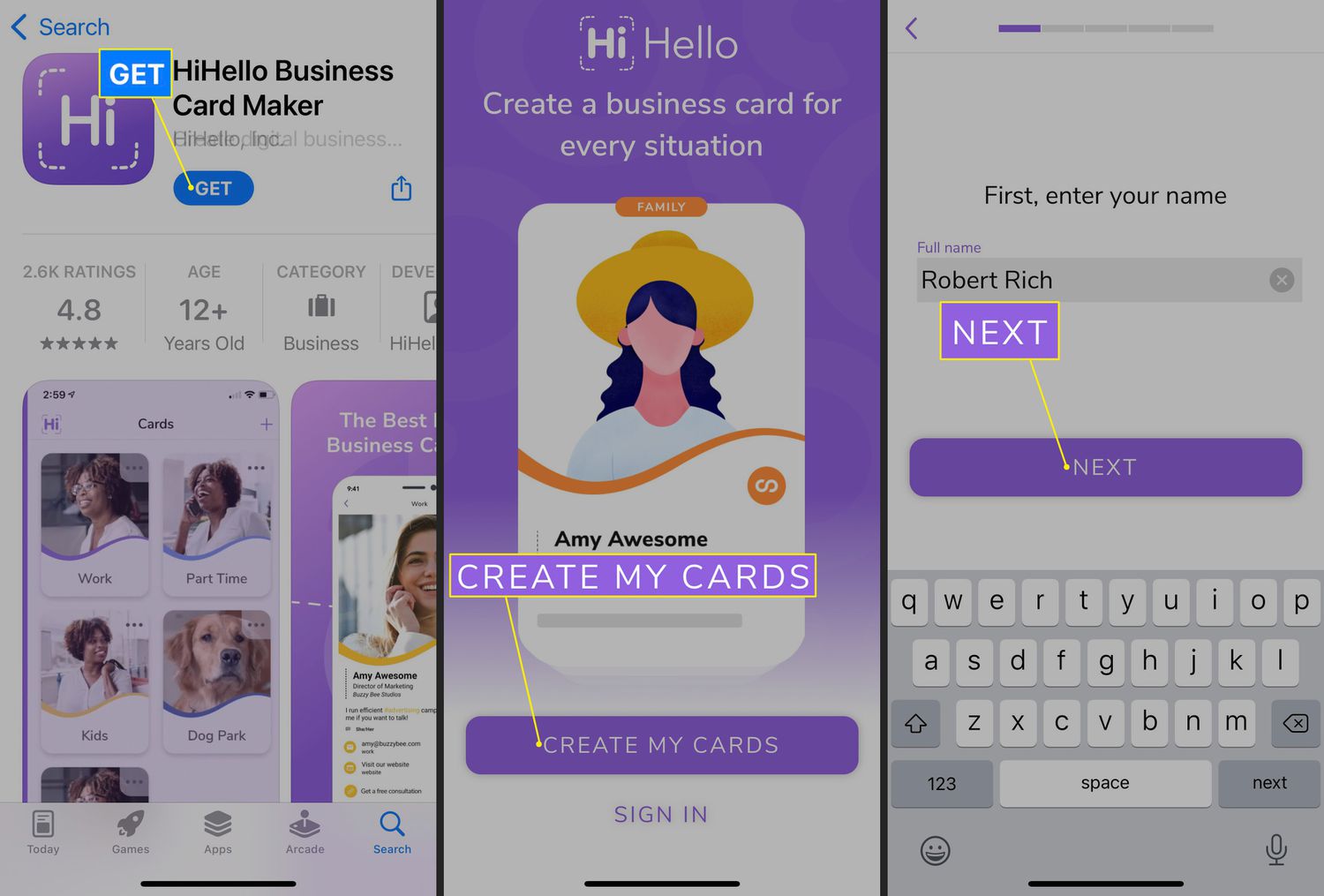
2. A card made with a digital business card platform
These tools are built specifically for digital networking. They usually offer templates, customization, QR codes, sharing tools, and contact-saving features. This is a smart choice if you want speed, ease, and minimal technical effort.
3. A wallet pass
If fast access is your priority, a wallet-based card can be a sleek option. It gives you a card-like experience stored on a phone, often with a scannable code that is ready to share quickly. This works especially well for conferences, events, and sales environments where seconds matter.
4. A QR code linked to a contact card or landing page
This is one of the most useful combinations. The QR code makes sharing easy, and the linked destination can be either a branded landing page or a downloadable contact file. You can place the code on your phone wallpaper, email signature, presentation slide, tabletop sign, packaging, or even a printed backup card.
5. An NFC-enabled card paired with a digital profile
This hybrid option blends physical and digital. Someone taps the card with their phone and your digital profile opens instantly. It is a great fit for professionals who still want a tangible object but also want the convenience of digital updates.
How to Make a Digital Business Card Step by Step
Step 1: Define the goal
Start by asking one simple question: what do you want this card to do?
Not every digital business card has the same job. A realtor may want people to view listings. A designer may want portfolio clicks. A consultant may want discovery calls. A job seeker may want recruiters to download a resume or connect on LinkedIn. If you do not define the goal, the design will drift.
Step 2: Gather your assets
Collect everything you need before building the card: your name, title, phone number, email, website, logo, colors, headshot, and any links you want to include. This saves time and helps your final design feel consistent rather than pieced together during a caffeine emergency.
Step 3: Pick a branded visual style
Use your business colors, consistent typography, and a clean layout. If you already have a website, social presence, or company branding, your digital business card should visually match them. Consistency builds trust. Random fonts build confusion.
As a rule, choose one or two fonts, keep contrast high, and make sure every text element is readable on a phone screen. Small, pale gray text may look elegant to you at 11:45 p.m. on a laptop. On a phone in sunlight, it looks like a cry for help.
Step 4: Write a sharp headline or value statement
Instead of listing only your title, consider adding one short line that explains what you do or who you help. For example:
“Brand strategist helping founders clarify their message.”
“Residential realtor serving first-time buyers in Austin.”
“Freelance copywriter for healthcare and B2B brands.”
This small detail makes your card easier to remember and more useful when someone revisits it later.
Step 5: Add one clear call to action
Every good digital business card should tell the visitor what to do next. Choose one main action. Some examples:
- Book a free consultation
- View my portfolio
- Save my contact
- Visit our website
- See product demo
You can include secondary links, but the main action should be obvious. A card with no clear next step is like introducing yourself and then immediately walking into a hedge.
Step 6: Create a QR code and test it
Once your card or landing page is ready, generate a QR code that points to it. Make sure the code opens quickly, works on both iPhone and Android, and sends people to a page that looks good on mobile. Test it with different lighting, different devices, and different camera apps.
If your QR code leads to a page with broken formatting, slow load time, or confusing navigation, people will leave. Politely, silently, and forever.
Step 7: Offer a save-contact option
This is one of the smartest features you can add. A digital business card should not just display your contact details; it should make saving them easy. A downloadable vCard or similar contact-save option reduces friction and increases the odds that your information ends up in someone’s phone instead of the mental junk drawer labeled “I should follow up with that person.”
Step 8: Share it in multiple places
Do not let your card live in only one place. Add it to your email signature, social profiles, conference badge, presentation deck, online bio, and messaging apps. You can also save the QR code as your phone lock screen or wallpaper for in-person events. The easier it is to access, the more often you will actually use it.
Design Tips That Make Your Card Look Professional
Keep the hierarchy obvious
Your name should stand out first. Your role, company, and main action should follow. If everything is bold, nothing is bold. If everything is exciting, nothing is exciting. Give the eye an obvious path.
Use white space generously
White space is not wasted space. It makes your content feel more premium, easier to scan, and less chaotic. Resist the urge to fill every area. A crowded card feels like a suitcase someone sat on to close.
Use a great photo if your role is relationship-driven
If you are in sales, consulting, coaching, recruiting, real estate, or any client-facing field, a strong headshot can make your card feel more personal and memorable. Choose a photo that looks professional, current, and human. “Human” is important.
Make it mobile-first
Design for a phone screen, not a desktop fantasy. Buttons should be easy to tap. Text should be readable without zooming. Links should open cleanly. Your digital business card is a small user experience, so treat it like one.
Common Mistakes to Avoid
- Adding too much information: More content does not equal more value.
- Using low-quality visuals: A blurry logo or pixelated QR code makes the whole card feel cheap.
- Forgetting accessibility: Tiny text and weak contrast are design mistakes, not personality traits.
- No clear call to action: If people do not know what to do next, most will do nothing.
- Linking to unfinished pages: Your digital card should not send people to a ghost town.
- Ignoring privacy: Share only the information you truly want public.
Privacy, Security, and Trust Matter More Than People Think
Convenience is great, but professionalism also means being careful with personal data. A digital business card should share the right information, not every detail you have ever entered into a contact app at 2 a.m.
Think intentionally about which phone number, email address, and location details you want visible. If your card includes a downloadable contact file, review the fields before sharing. If you use a QR code, make sure it points to a trusted destination and test the preview URL before distributing it widely.
This is especially important for solo professionals, service businesses, consultants, and anyone working from home. A polished digital card feels modern. An oversharing one feels accidental.
How to Share a Digital Business Card Effectively
Making the card is only half the job. The other half is using it naturally.
At networking events, open your QR code and let people scan it without making the moment awkward. During video calls, drop your card link in the chat. In email, place it in your signature under your name. On social media, use it in your bio or link hub. In person, an NFC card or phone-based wallet pass can make sharing feel seamless.
The trick is to remove friction. People are far more likely to save your information when you make the process feel instant and easy.
How to Tell If Your Digital Business Card Is Actually Working
A beautiful card is nice. A useful card is better.
Pay attention to what happens after people receive it. Are they clicking through to your site? Booking meetings? Following you on LinkedIn? Saving your contact? If your card is getting shared but not converting into real follow-up, something may need improvement.
Usually the fix is one of these:
- Your card is too busy
- Your main action is unclear
- Your message is too generic
- Your design does not build enough trust
- Your linked page is weak or slow
Treat your digital business card like a tiny conversion tool. Make small updates, test them, and improve the experience over time.
Experiences Related to Making and Using a Digital Business Card
One of the most common experiences people have after making a digital business card is realizing that the card is not really about technology at all. It is about clarity. Plenty of professionals start with the idea that they need something flashy: animated backgrounds, five social icons, a giant logo, maybe a quote that sounds like it belongs on a motivational mug. Then they use the card in the real world and discover that the most effective version is usually the simplest one. The people they meet do not want a puzzle. They want a fast way to remember who they met and how to reach that person later.
Another common experience happens at events. Someone creates a digital card, adds a QR code, and feels pretty clever, which is fair. Then they arrive at a conference and learn an important lesson: if the code is too small, too low-contrast, or buried under glare on a phone screen, people hesitate. After that first awkward round of “Wait, can you scan it? No, tilt it. No, other way,” they usually go home and make the code bigger, cleaner, and easier to access. It is a humbling but useful moment. Digital convenience still needs practical design.
Freelancers often report another interesting shift. Once they build a digital business card with a portfolio link, inquiry button, and clear positioning statement, they stop introducing themselves in vague terms. Instead of saying, “I do a bit of marketing and content and strategy and some other stuff depending on the moon,” they say something sharper, like, “I help health brands turn technical topics into readable content.” The card becomes a branding tool not just for the audience, but for the creator too. It forces better messaging.
Small business owners often find that digital cards work best when tied to a specific action. A bakery owner may link to catering orders. A real estate agent may link to current listings. A consultant may link to a scheduling page. A photographer may send people straight to a gallery. In those cases, the card stops being a static contact sheet and starts functioning like a tiny business funnel. That is when people usually realize the real value is not “looking modern.” It is making follow-up easier.
There is also the experience of fixing oversharing. Many first-time users put too much on the card: personal social accounts, secondary phone numbers, a full address, maybe even links they barely maintain. After a few weeks, they trim it down. This editing phase is healthy. It usually leads to a more professional card, a stronger sense of personal boundaries, and a cleaner presentation overall.
Perhaps the most useful experience of all is this: once someone gets used to having a digital business card ready to go, they use it far more often than they expected. They share it after meetings, in email signatures, on webinars, in DMs, and during chance encounters. What started as “I should probably make one of these” becomes part of how they show up professionally. And that is the whole point. A good digital business card is not just something you build. It is something you actually use.
Final Thoughts
If you want to make a digital business card that feels modern, effective, and professional, keep the mission simple: make it easy for people to understand who you are, what you do, and what to do next. Choose a format that matches your needs, keep your information focused, use clean branding, add a strong call to action, and test the sharing experience on real devices.
The best digital business card is not the one with the most features. It is the one that removes friction, builds trust, and helps people remember you after the conversation ends. Make it clear. Make it useful. Make it easy to save. That is how a small card can do a surprisingly big job.