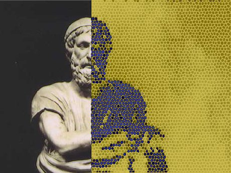
Somewhere in the great classroom of imagination, Homer is holding a lyre in one hand and a dashboard full of colorful charts in the other. Achilles is still furious, Odysseus is still suspicious of strangers offering wooden furniture, and modern students are asking a new question: what happens when ancient epic meets data visualization?
The answer is surprisingly exciting. Data visualization and the classics may sound like two guests seated at the wrong dinner party, but they get along beautifully. Classical literature is full of patterns: repeated phrases, wandering heroes, family networks, battlefield movements, divine interventions, place names, speeches, journeys, and emotional spikes big enough to make Mount Olympus request a wellness retreat. When those patterns are mapped, charted, tagged, and analyzed, ancient texts become more visible in ways that printed pages alone cannot always achieve.
This is the world of digital humanities, where scholars, teachers, students, librarians, programmers, and curious readers use technology to explore human culture. For classics, that means using digital tools to examine Greek and Roman texts, ancient geography, manuscripts, archaeology, and reception history. It does not replace close reading. Nobody is asking a pie chart to explain the grief of Priam. Instead, visualization gives readers another lens: one that can reveal structure, scale, movement, frequency, and relationships.
What Does Data Visualization Mean for the Classics?
Data visualization is the practice of turning information into visual form: maps, timelines, network graphs, heat maps, word clouds, dashboards, and interactive models. In the sciences, we use visualizations to understand climate, medicine, space, finance, and social trends. In the humanities, the data may be less about lab results and more about words, places, people, artifacts, manuscripts, and cultural connections.
In classical studies, a visualization might show how often a Greek word appears across the Iliad, where Odysseus travels in the Odyssey, how Roman roads connected provinces, or which characters speak most often in a tragedy. Suddenly, the ancient world is not just read line by line. It can also be seen as a system of relationships.
That matters because classical texts are dense. They were built for memory, performance, repetition, and cultural transmission. Homeric epic, for example, relies heavily on repeated formulas, epithets, scenes, and patterns. A reader may notice “swift-footed Achilles” after a few pages. A visualization can show where repeated phrases cluster, how they function, and what they reveal about oral tradition. It is like giving close reading a pair of night-vision goggles.
Why Homer Is Perfect for High-Tech Reading
Homer’s works are ideal for digital exploration because they are both ancient and highly structured. The Iliad and the Odyssey are not random piles of heroic shouting, though they do contain a respectable amount of heroic shouting. They are carefully patterned epics full of recurring names, places, themes, objects, speeches, and narrative turns.
Consider the Iliad. A traditional reading might focus on Achilles’ anger, Hector’s honor, the cost of war, or the fragile boundary between gods and mortals. A data visualization project can add another layer by tracking character mentions across books, mapping emotional intensity, comparing speeches, or visualizing networks of conflict and kinship. Students can see that the poem is not simply “about Achilles.” It is a living network of warriors, families, gods, cities, and consequences.
The Odyssey invites even more visual fun. It is basically the ancient Mediterranean’s most stressful travel blog. A map of Odysseus’ route can help readers understand geography, delay, danger, and narrative structure. Timelines can separate the order in which events are told from the order in which they happen. Network diagrams can show how hospitality, deception, loyalty, and recognition connect characters across the poem.
Real Digital Classics Projects Changing the Field
Perseus Digital Library: The Ancient Text Powerhouse
One of the most important digital classics resources is the Perseus Digital Library at Tufts University. Perseus provides access to Greek and Latin texts, translations, dictionaries, morphological tools, and related materials. For readers working with Homer, Plato, Vergil, Herodotus, or other ancient authors, Perseus makes classical texts searchable and usable in ways that printed books alone cannot match.
From an SEO-friendly search perspective, Perseus is the kind of resource that demonstrates why “digital classics” is more than a trendy phrase. It allows students and scholars to move between original languages, translations, word forms, and references. When connected with visualization tools, searchable texts become datasets. A passage becomes a pattern. A word becomes a trail.
The Homer Multitext Project: Manuscripts in Motion
The Homer Multitext Project focuses on the textual tradition of Homer, especially the Iliad, manuscripts, scholia, and variations. Instead of treating Homer as one fixed text sealed in literary marble, the project emphasizes the richness of transmission. Ancient and medieval manuscripts preserve not only the poem but also commentary, variants, and scholarly traditions.
For data visualization, this is gold. Textual variants can be compared. Manuscript relationships can be explored. Scholia can be linked to lines of poetry. The result is a more dynamic view of Homer: not a single frozen statue, but a long, complex conversation across centuries. It is Homer with footnotes, family trees, and a very impressive archive cabinet.
The Chicago Homer: Patterns in Early Greek Epic
The Chicago Homer is another major resource for exploring early Greek epic. It provides multilingual access to Homeric and related texts and supports analysis of formulaic language. This matters because Homeric poetry was shaped by oral tradition, where repeated phrases and metrical patterns helped poets compose and audiences understand enormous works.
With tools like this, readers can investigate repetition instead of merely noticing it. They can compare how names, phrases, and formulaic expressions appear across the epics. This is especially useful in classrooms because students can move from “I think this phrase appears a lot” to “Here is visual evidence showing how and where it appears.” That shift is small but powerful. It turns interpretation into inquiry.
Pleiades: Mapping the Ancient World
Pleiades is a community-built gazetteer of ancient places. It provides authoritative information about ancient locations and makes that information reusable for maps, digital projects, and research. For classics, ancient history, archaeology, and geography, Pleiades is a backbone resource because place names in ancient texts are often complicated. The same place may have multiple names, uncertain locations, or changing historical contexts.
When a student reads about Troy, Ithaca, Sparta, Thebes, or Alexandria, Pleiades-style geospatial data can help place those locations in a broader network. Add visualization, and the ancient world becomes navigable. Instead of a flat list of names that sound like they belong in a mythological phone book, readers see distances, clusters, routes, and relationships.
ORBIS: Rome as a Network
Stanford’s ORBIS project models travel and transportation across the Roman world. It reconstructs routes, time, cost, and seasonal variation across roads, rivers, and sea lanes. While ORBIS focuses on Rome rather than Homer specifically, it is a perfect example of what data visualization can do for ancient studies.
A Roman journey was not just a line from Point A to Point B. It involved expense, weather, roads, ships, terrain, and political geography. ORBIS helps users understand how movement shaped empire. This kind of model changes how students think about ancient power. Rome was not merely a city with good sandals and confident architecture. It was a system of communication, logistics, and connection.
HESTIA and the Spatial Reading of Herodotus
The HESTIA project uses digital mapping technologies to study Herodotus’ Histories. By extracting and analyzing place names, it explores the cultural geography of an ancient narrative. This is important because Herodotus does not simply describe places. He builds meaning through movement, comparison, distance, and storytelling.
For anyone interested in Homer, HESTIA offers a useful model. Epic and historical narratives both depend on space. Where characters travel, where battles occur, and how places are named can reveal cultural assumptions. Mapping a text does not reduce literature to geography. It helps us ask sharper questions about how geography creates meaning.
From Word Clouds to Network Graphs: Tools That Make Classics Visible
Data visualization in the classics can be simple or sophisticated. A beginner might start with a word frequency chart showing the most common names in a text. A more advanced project might use natural language processing to tag grammatical forms, identify named entities, or build character networks.
Word clouds are popular because they are easy to understand, though they should be used carefully. They can show which terms appear often, but they do not explain context. A word cloud of the Iliad might make “Achilles,” “Hector,” “Achaeans,” and “Trojans” visually prominent. That is useful, but it is only the appetizer. The main course comes when students ask where those words appear, who uses them, and how their meanings change.
Timelines are especially helpful for epics because ancient narratives often play with time. The Odyssey begins near the end of Odysseus’ journey, then uses stories within stories to fill in the past. A timeline can help students separate narrative order from chronological order. In other words, it can prevent the common classroom condition known as “Wait, when did the Cyclops happen?”
Network graphs are excellent for character relationships. In Homer, gods and mortals interact constantly. Athena supports Odysseus. Apollo favors the Trojans. Zeus attempts cosmic management while everyone else makes his job unnecessarily dramatic. A network graph can show alliances, conflicts, family ties, and divine interventions. This turns mythology into a visible web of influence.
Maps may be the most intuitive visualization for ancient literature. They can show travel, trade, colonization, war, exile, pilgrimage, and cultural contact. When maps are linked to texts, readers can click a place and see where it appears. This is especially powerful for students who are new to ancient geography. The map becomes a bridge between unfamiliar names and meaningful spaces.
How Data Visualization Improves Teaching
For teachers, data visualization is not a gimmick. It is a way to make difficult texts more approachable without watering them down. Students who might feel intimidated by Homer can begin with a question: Which characters speak the most? Where do gods intervene? How often does the poem mention ships? Which places appear in Odysseus’ story? These questions are concrete, searchable, and visual.
Once students gather data, they must interpret it. That is where the real learning happens. A chart does not automatically create insight. It invites argument. If Achilles is absent for large sections of the Iliad, why does his presence still dominate the poem? If a map of the Odyssey shows constant movement, what does that suggest about homecoming? If repeated phrases cluster in certain scenes, how do they shape the audience’s expectations?
This approach also supports different learning styles. Some students love close reading. Others understand better through images, patterns, and spatial thinking. Data visualization gives the class more doors into the same house. The house is still ancient literature. It just has better lighting now.
The Human Side of Digital Humanities
The phrase “digital humanities” can sound cold, as if someone placed a marble bust inside a server rack. But the best digital humanities work is deeply human. It asks how technology can help us understand culture, language, memory, and meaning. In classical studies, visualization can make the ancient world feel less distant and more alive.
Digital tools also encourage collaboration. A classics project may involve a Greek scholar, a librarian, a programmer, a cartographer, a teacher, and students. One person understands manuscript tradition. Another builds the database. Another designs the interface. Another asks the annoyingly excellent question that improves the whole project. This collaborative model reflects the complexity of ancient evidence itself.
Open data is another key benefit. Resources like digital libraries, gazetteers, and annotation platforms make classical materials more accessible to people outside elite research environments. A curious high school student, a community college instructor, or an independent reader can explore texts and data that once required specialized collections. The classics become less like a locked temple and more like a public workshop.
Where Data Visualization Can Mislead
Of course, not every chart is a revelation. Some are just colorful confusion wearing a nice jacket. Data visualization must be used responsibly, especially with ancient materials. Classical texts survive through complicated transmission. Manuscripts differ. Translations vary. Place names can be uncertain. Ancient geography does not always match modern borders. A clean-looking map may hide messy scholarly debates.
There is also the risk of mistaking frequency for importance. A character mentioned often is not automatically the deepest character. A word that appears rarely may still be crucial. Silence, absence, irony, and ambiguity are hard to chart. No dashboard can fully capture the emotional force of Hector saying farewell to Andromache or Odysseus finally revealing himself. Some meanings must still be felt, argued, and reread.
The best approach is balance. Use visualization to notice patterns, then return to the text. Let the data raise questions, not replace interpretation. A graph can point toward a mystery. The reader still has to solve it.
Specific Examples of Classroom Projects
1. Mapping Odysseus’ Journey
Students can create a map of major locations in the Odyssey, such as Troy, Ithaca, Pylos, Sparta, Ogygia, Scheria, and the land of the Cyclopes. For each location, they can add a short explanation of what happens there and why it matters. The final map becomes both a study guide and an argument about movement, delay, and identity.
2. Tracking Divine Intervention in the Iliad
Students can record every major moment when a god directly influences events. Then they can visualize which gods intervene most often and for whom. This helps students see the epic not only as a war story but also as a theological drama in which divine politics constantly shape human suffering.
3. Building a Character Network
A class can build a network graph of relationships among Achilles, Patroclus, Hector, Priam, Agamemnon, Athena, Zeus, Apollo, and other major figures. Connections might represent family ties, conflict, conversation, protection, or revenge. The graph becomes a visual essay about power and dependency.
4. Comparing Translations
Students can compare how different English translations render key Greek terms such as kleos, nostos, mênis, or xenia. A table or chart can show patterns in translation choices. This makes students aware that translation is interpretation, not a magical conveyor belt from Greek to English.
5. Visualizing Repeated Phrases
Homeric epithets and formulas can be tracked across the poems. Students might examine how often “rosy-fingered dawn” or character-specific epithets appear, then ask why repetition matters. The answer leads directly into oral tradition, meter, memory, and performance.
Data Visualization, AI, and the Future of Classics
New technologies are expanding what digital classics can do. Natural language processing tools, including resources designed for pre-modern languages, can help analyze morphology, syntax, and vocabulary. Annotation platforms can connect names and places to linked open data. Machine learning may assist with manuscript transcription, image analysis, and pattern recognition.
Still, classics needs human judgment more than ever. Ancient languages are complex. Context matters. A computer may identify a pattern, but it cannot automatically understand why that pattern is culturally significant. The future of digital classics will belong to people who can combine technical skill with historical sensitivity. In other words, bring both the spreadsheet and the soul.
For Homer, this future is especially promising. Imagine interactive editions where readers can move between Greek text, translation, manuscript images, scholia, maps, audio performance, character networks, and thematic visualizations. Imagine students exploring the Iliad not as a dusty obligation but as a living data-rich world. Imagine Achilles with a dashboard. He would still be angry, obviously, but at least now we could chart the trend line.
Extended Experience: Learning Homer Through High-Tech Eyes
The first time many students meet Homer, the experience can feel like being dropped into a family reunion where everyone has a spear, a genealogy, and a grudge. Names arrive quickly. Places blur together. Gods interfere. Heroes deliver speeches. Someone insults someone else’s honor, and suddenly the entire Bronze Age needs a timeout. This is exactly where data visualization can change the experience.
In a classroom setting, a simple visual project can make Homer less intimidating. For example, when students map character appearances across the Iliad, they often notice something surprising: the poem’s emotional center is not always the same as its numerical center. Achilles may disappear from the battlefield for long stretches, yet the consequences of his anger remain everywhere. Seeing that pattern visually helps students understand how absence can function like presence. The empty space becomes meaningful.
Another powerful experience comes from mapping the Odyssey. Students sometimes assume that Odysseus’ journey is a straightforward adventure route, like an ancient GPS with worse customer service. But when they place episodes on a map and compare geography with narrative order, they see that the poem is less about efficient travel and more about memory, storytelling, temptation, identity, and return. The map does not solve the poem. It makes the poem stranger in a useful way.
Word frequency projects can also spark excellent discussion. A class might track words related to ships, home, glory, grief, or anger. At first, students may treat the chart like a scoreboard. Which word “wins”? But the better question is not which term appears most often. The better question is where it appears, who uses it, and what emotional pressure surrounds it. That is when visualization becomes interpretation rather than decoration.
One of the most memorable uses of digital classics is the character network. When students connect mortals and gods, the ancient world suddenly looks like a social media platform moderated by Zeus, which explains a lot and also nothing. Athena’s relationship with Odysseus becomes visible. Apollo’s support for the Trojans becomes part of a broader divine pattern. Human choices appear inside a web of family, loyalty, violence, and supernatural influence.
These experiences show why data visualization works so well with the classics. It gives students permission to investigate. They do not have to begin with a perfect thesis about epic poetry. They can begin with data: a name, a place, a repeated phrase, a route, a speech. Then they ask what the pattern means. That movement from observation to interpretation is the heart of humanities learning.
There is also joy in the process. Students who might never volunteer to scan Greek meter may happily build a timeline, design a map, or debate whether a network edge should represent conflict, friendship, kinship, or divine meddling. The work becomes active. Homer stops being a monument and becomes a landscape. Readers can walk around in it, zoom out, zoom in, and notice the architecture.
For teachers and writers, the lesson is clear: high-tech tools do not make ancient literature less human. Used well, they make it more approachable, more discussable, and more surprising. Data visualization gives the classics a new classroom vocabulary. It helps modern readers see old stories with fresh eyes. And if Homer himself could see these tools, he might not call them “technology.” He might call them another form of song: patterned, memorable, shared, and built to carry meaning across time.
Conclusion: The Ancient World Looks Good in Data
Homer meets high-tech not because ancient literature needs rescuing, but because great texts can survive new methods. Data visualization does not flatten the classics into charts. It opens new paths into them. Maps reveal journeys. Timelines clarify structure. Networks expose relationships. Text analysis highlights repetition and theme. Digital archives bring manuscripts and languages within reach of wider audiences.
The classics have always depended on tools: papyrus, parchment, codices, printing presses, commentaries, dictionaries, concordances, and now databases, maps, and interactive visualizations. Each tool changes what readers can notice. The goal is not to make Homer modern. The goal is to let modern readers encounter Homer more fully.
In the end, data visualization and classical studies make an unexpectedly strong team. One brings pattern, scale, and interactivity. The other brings language, memory, beauty, conflict, and the stubborn human habit of asking what it all means. Put them together, and the ancient world does not look smaller. It looks bigger, brighter, and wonderfully alive.
SEO Tags
Note: This article synthesizes real information from established digital humanities and classics resources, including Perseus Digital Library, the Homer Multitext Project, the Chicago Homer, Pleiades, ORBIS, HESTIA, Recogito, CLTK, Library of Congress Labs, NEH-related digital humanities work, and university-based digital classics initiatives.