Some album covers are iconic. Some are elegant. Some make you want to frame them, hang them in your living room, and pretend you have impeccable taste in both music and typography. And then there are the other ones: the cursed sleeves, the design catastrophes, the fever-dream visuals that look like they were approved at 2:13 a.m. by a bandmate who kept saying, “No, trust me, this is art.”
That is the chaotic little corner of music history we are visiting today. Across music magazines, fan-voted lists, Reddit threads, and community roundups, the same offenders pop up again and again whenever people debate the worst album covers of all time. Some are offensive. Some are hilariously cheap. Some are visually confusing in a way that feels almost aggressive. And a few are attached to genuinely good albums, which somehow makes the bad cover art even funnier.
This is not a scientific ranking handed down from a panel of sober museum curators in turtlenecks. It is a big, gloriously judgmental roundup of the album covers internet users keep dragging because they are awkward, ugly, baffling, or impossible to forget. So let us respectfully open the vault of visual bad decisions and revisit 27 album covers that people still roast with the enthusiasm of a group chat discovering an old haircut photo.
Why bad album covers never stop haunting the internet
The reason terrible album art stays alive for decades is simple: a bad cover does not just fail, it performs. It becomes a meme before memes existed. It creates instant emotional confusion. It can make a serious band look unserious, a great album look unlistenable, or a questionable creative idea look like evidence in a trial involving airbrush software.
The worst album covers usually fail in one of four ways. First, there is the too much concept, not enough taste problem. Second, there is the cheap graphic design disaster problem, which often involves terrible fonts, uncanny edits, or enough glow effects to power a shopping mall in 1998. Third, there is the shock-for-shock’s-sake approach, where controversy becomes the whole visual pitch. And finally, there is the most deliciously tragic category of all: the cover that thinks it looks cool.
With that happy thought in mind, here are 27 of the worst album covers ever, at least according to years of listicles, fan complaints, and internet users who clearly still have not recovered.
27 album covers internet users still cannot unsee
-
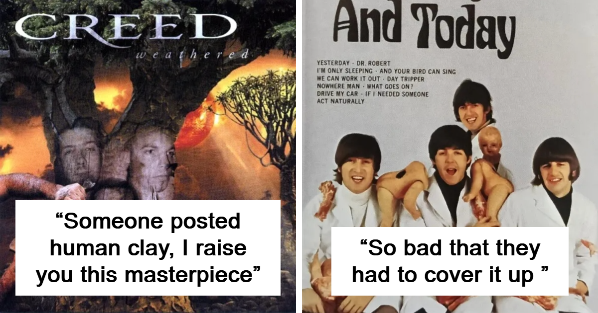
The Beatles – Yesterday and Today
The infamous “butcher cover” is one of rock history’s most notorious visual misfires. It was meant as provocative pop art, but most people just saw a deeply unpleasant image and recoiled. It has historical importance, sure, but “important” and “good to look at” are not the same thing.
-
Blind Faith – Blind Faith
This cover lands on worst-of lists because it crossed a line that many listeners never felt comfortable with. Even when writers try to explain the artistic symbolism, the image still feels like a bad decision wrapped in lofty language. If your audience needs a panel discussion to tolerate the art, the art may have lost.
-
Scorpions – Virgin Killer
There are bad covers, and then there are covers that trigger years of backlash, censorship, and “why on earth was this approved?” reactions. This one remains a frequent answer in fan threads for obvious reasons. It is less a design failure than a giant red warning siren with a record label attached.
-
Aerosmith – Get a Grip
If a cover can make people laugh, wince, and ask whether the concept meeting went terribly wrong, it belongs here. Get a Grip is often singled out because it is both overcommitted and weirdly literal. It is one of those sleeves that makes you feel secondhand embarrassment on behalf of everyone in the room.
-
Lady Gaga – Born This Way
Plenty of pop fans love Gaga’s flair for the dramatic, but even many defenders admit this cover is a lot. The human-motorcycle hybrid image was meant to be surreal and fearless. Instead, it inspired years of “I understand the intention, but I still hate looking at it” energy.
-
Yeah Yeah Yeahs – Mosquito
People who adore the band still roast this cover with real passion. The giant bug attacking a baby has a grindhouse-comic quality, but not in a way that charms everyone. It feels gross, noisy, and deliberately irritating, which might be the point, though that does not make it easier on the eyeballs.
-
Iron Maiden – Dance of Death
This cover is the patron saint of unfinished-looking CGI. Fans have spent years dunking on the awkward digital crowd, strange proportions, and overall “early demo file accidentally sent to print” vibe. It is legendary because Iron Maiden usually nails its artwork, which makes this collapse feel even more dramatic.
-
Black Flag – What The…
The punk legends gave the world a cover so disliked that people still talk about it with the tone normally reserved for cursed objects. The cartoonish style feels cheap, loud, and weirdly off-brand. It does not look rebellious so much as aggressively unfinished.
-
Creed – Human Clay
The faux-spiritual, vaguely CGI-human imagery screams late-1990s seriousness in the funniest possible way. It is the kind of cover that wants you to contemplate the human condition but accidentally invites you to giggle in the used CD section instead.
-
Limp Bizkit – Chocolate Starfish and the Hot Dog Flavored Water
Even before the title finishes kicking down the door, the cover art arrives with all the subtlety of a skateboard through a mall window. It is loud, gaudy, and proudly ridiculous. Some people defend it as perfectly matching the band. Unfortunately, that is not exactly a rescue argument.
-
Emerson, Lake & Palmer – Love Beach
The music world contains many accidental comedy covers, and this is one of the greatest. The tropical setting, heroic poses, and glossy styling make the band look less like prog-rock giants and more like they are filming a very expensive yogurt commercial in 1978.
-
Elton John – Leather Jackets
Elton John has had plenty of great visuals, which only makes this one stand out more. The styling is stiff, the mood feels forced, and the whole thing gives off “trying very hard to seem edgy” energy. Internet users love this cover because it looks like a costume idea that should have been vetoed early.
-
Roger Daltrey – Ride a Rock Horse
This is a classic entry in the “what am I even looking at?” hall of fame. It is theatrical, glossy, and deeply strange in a way that inspires fascination and regret at the same time. No one forgets it, which might be a backhanded compliment.
-
Ringo Starr – Ringo the 4th
Not every bad cover needs controversy to earn ridicule. Sometimes all it takes is a spectacular lack of cool. This one has the awkward glamour of a department-store ad that somehow wandered onto a record sleeve and refused to leave.
-
Raven – The Pack Is Back
Metal fans bring this one up constantly because it is almost too perfect a disaster. The styling is baffling, the costumes make no real sense, and the locker-room concept feels like a prank committed by an enemy of heavy metal. It is bad in a strangely athletic way.
-
Big Bear – Doin Thangs
Pen & Pixel excess reached a kind of surreal fever pitch here. Fans of ridiculous rap covers point to this album as a monument to “more is more and then somehow even more.” If visual subtlety were a food group, this cover would refuse to eat it.
-
Criminal Elament – Hit ’Em Where It Hurt
Bad hip-hop cover art often becomes internet folklore, and this one is a prime specimen. Floating figures, random imagery, and absolute confidence combine into a sleeve that looks like three unrelated ideas were welded together with chrome effects and wishful thinking.
-
Ludacris – Chicken-n-Beer
This cover is not poorly made, exactly. It is just a little too committed to its own joke, and the joke lands somewhere between goofy and unsettling. That is why it keeps turning up in discussions about otherwise successful albums with cover art that makes people squint.
-
Milli Vanilli – All or Nothing
The styling here is pure late-1980s excess, preserved like a mosquito in amber. Big attitude, bigger hair, and a visual confidence that has not aged gracefully. It is not the only cover from that era to overdo it, but it is certainly one of the easiest to tease.
-
The Rolling Stones – Dirty Work
There is something almost admirable about how unpleasant this color palette is. The neon aggression, stiff posing, and fashion-overload aesthetic give the whole thing a synthetic weirdness. It looks exactly like the kind of cover people defend with the phrase, “You had to be there.”
-
KISS – Hot in the Shade
KISS built a career on striking imagery, so when they miss, the miss has its own fireworks. This cover gets mocked because it feels cluttered, gimmicky, and oddly generic for a band known for larger-than-life presentation. It is all shade, not much heat.
-
Ted Nugent – Scream Dream
Every era has at least one cover that makes modern viewers say, “Nope, absolutely not.” This is one of them. It is heavy-handed, tacky, and very sure of itself in a way that has aged like warm milk in direct sunlight.
-
Toby Keith – Unleashed
Country music is not immune to bad cover art, and this one often gets mentioned because it radiates maximum macho sincerity with minimum visual finesse. It is not outrageous enough to be camp and not polished enough to be elegant, which is a rough place to live.
-
Prince – Lovesexy
Prince could pull off visuals that nobody else on earth could even attempt, but this cover still divides people. Some view it as bold and theatrical. Others see a strange, overripe flower fantasy that belongs on a fragrance box from an alternate universe. As always with Prince, your mileage may shimmer.
-
Black Sabbath – Born Again
This cover has defenders, mostly because it is memorably grotesque. But it also appears on countless worst-cover roundups because the demon-baby image is so loud and unsettling that it can feel more goofy than menacing. It is trying to scare you and kind of ends up yelling.
-
Van Halen – Balance
There is a long tradition of album covers that want to be provocative and wind up just being uncomfortable. Balance regularly gets cited in that category. The visual concept is unforgettable, yes, but in exactly the same way you remember accidentally stepping on a Lego.
-
The Jimi Hendrix Experience – Electric Ladyland (original UK cover)
One of rock’s most celebrated albums somehow became attached, in one edition, to cover art that many people still consider baffling and exploitative rather than inspired. It is a classic example of a record so good that listeners almost collectively agreed to mentally replace the sleeve.
-
NOFX – Heavy Petting Zoo
This is one of those covers people mention with a wince before immediately changing the subject. Shock humor can work, but this one feels so determined to provoke that it circles back into plain bad taste. Internet users keep bringing it up because, sadly, forgetting it is difficult.
-
Manic Street Preachers – Journal for Plague Lovers
Not everyone calls this cover ugly, but many do call it deeply off-putting. Its art-world seriousness and disturbing visual effect sparked censorship and debate, which is exactly why it still appears in conversations about album covers people wish they had never stumbled across in the first place.
What these design disasters actually teach us about album art
If there is one lesson buried beneath all this glorious visual wreckage, it is that album packaging matters more than artists sometimes admit. A great cover can sharpen an era, create mythology, and make an album feel larger than life. A terrible one can distract from the music, date it instantly, or turn an ambitious idea into an involuntary comedy sketch.
What makes these worst album covers so fascinating is that most of them are not forgettable. They are unforgettable for the wrong reasons. They get screenshotted, memed, ranked, reposted, and rediscovered by younger listeners who were not even alive when the records came out. In other words, bad album art has a weird afterlife. It fails at elegance but succeeds at survival.
And to be fair, some of these covers have become so infamous that they now carry a kind of accidental charm. Once enough years pass, terrible design can harden into camp. The public stops asking, “Who approved this?” and starts asking, “How did this happen, and can I show it to my friends immediately?” That is not exactly redemption, but it is a form of immortality.
The experience of discovering a truly awful album cover in the wild
There is a very specific experience that comes with finding one of these terrible album covers for the first time, and anyone who has spent enough time digging through record bins, old blog archives, or random music threads online knows the feeling. At first, there is disbelief. You stop scrolling. You lean in. You wonder whether this is parody, bootleg art, or a prank designed by someone who hated the band. Then comes the second wave, which is the part where your brain realizes, with increasing horror, that no, this was a real commercial product. Someone photographed it, approved it, printed it, shipped it, and expected human beings to voluntarily bring it into their homes.
That is why bad album covers are such a strangely social form of entertainment. You almost never want to suffer alone. The moment you see one, your first impulse is to send it to another person with a message like, “Please explain this,” or, “I regret to inform you that this exists.” It becomes a shared event. Great album art inspires admiration, but terrible album art inspires conversation. It creates an instant mini-community of confused witnesses.
There is also a weird archaeological thrill in it. A bad album cover can trap the visual habits of its era more effectively than a good one. Airbrushed rap sleeves, over-serious metal paintings, painfully dated pop glamour, macho country poses, awkward CGI experiments, neon overload, bizarre symbolism, random animals, unnecessary leather, impossible fonts, and enough smoke effects to suggest somebody owned one very enthusiastic editing program—all of it tells a story. Sometimes that story is, “The 1980s were not okay.” Sometimes it is, “The early digital era gave too many people dangerous confidence.” But it is always a story.
And the funniest part is that a lot of these covers are attached to music that ranges from decent to excellent. That mismatch is what makes the phenomenon so memorable. When the songs are bad too, the cover just becomes part of the wreckage. But when the music is strong, the terrible artwork feels almost theatrical, like a banana peel placed at the entrance to a beautiful concert hall. Fans wind up creating their own internal workaround: they love the album while pretending not to notice the packaging, the way relatives politely ignore an ugly couch nobody wants to discuss.
In the streaming era, album art no longer has the same physical power it once did, but that has not killed the fascination. If anything, it has made bad covers more screenshot-friendly and easier to spread. One cursed image can now circle the internet in minutes, picked apart by fans, mocked by strangers, defended by one brave contrarian, and eventually inducted into the unofficial museum of cover art calamities. These sleeves endure because they are visual mistakes with personalities. They do not just look bad. They make people feel something vivid and immediate, even if that feeling is “absolutely not.”
So yes, terrible album covers can be ugly, tasteless, dated, or wildly misguided. But they are also unforgettable little time capsules of ambition gone sideways. And in their own ridiculous way, they remind us that music culture is not built only on masterpieces. Sometimes it is built on the moments that make us laugh, gasp, cringe, and ask the oldest question in pop history: who said yes to this?
Conclusion
The worst album covers of all time are not just bad pictures attached to records. They are pop-culture artifacts, cautionary tales, and accidental comedy gold. They show how visual branding can go wrong in a hundred different ways, from tasteless shock tactics to bargain-bin design choices that should never have escaped the mood board. Yet that same awfulness is exactly why people keep talking about them.
In a strange way, these sleeves have achieved the thing every artist wants: they are still being noticed. Not for beauty, not for elegance, and definitely not for restraint—but noticed all the same. And maybe that is the final punchline of terrible album art. If listeners cannot always remember every song, they can absolutely remember the cover that made them say, “Wow, I wish I could unsee that.”