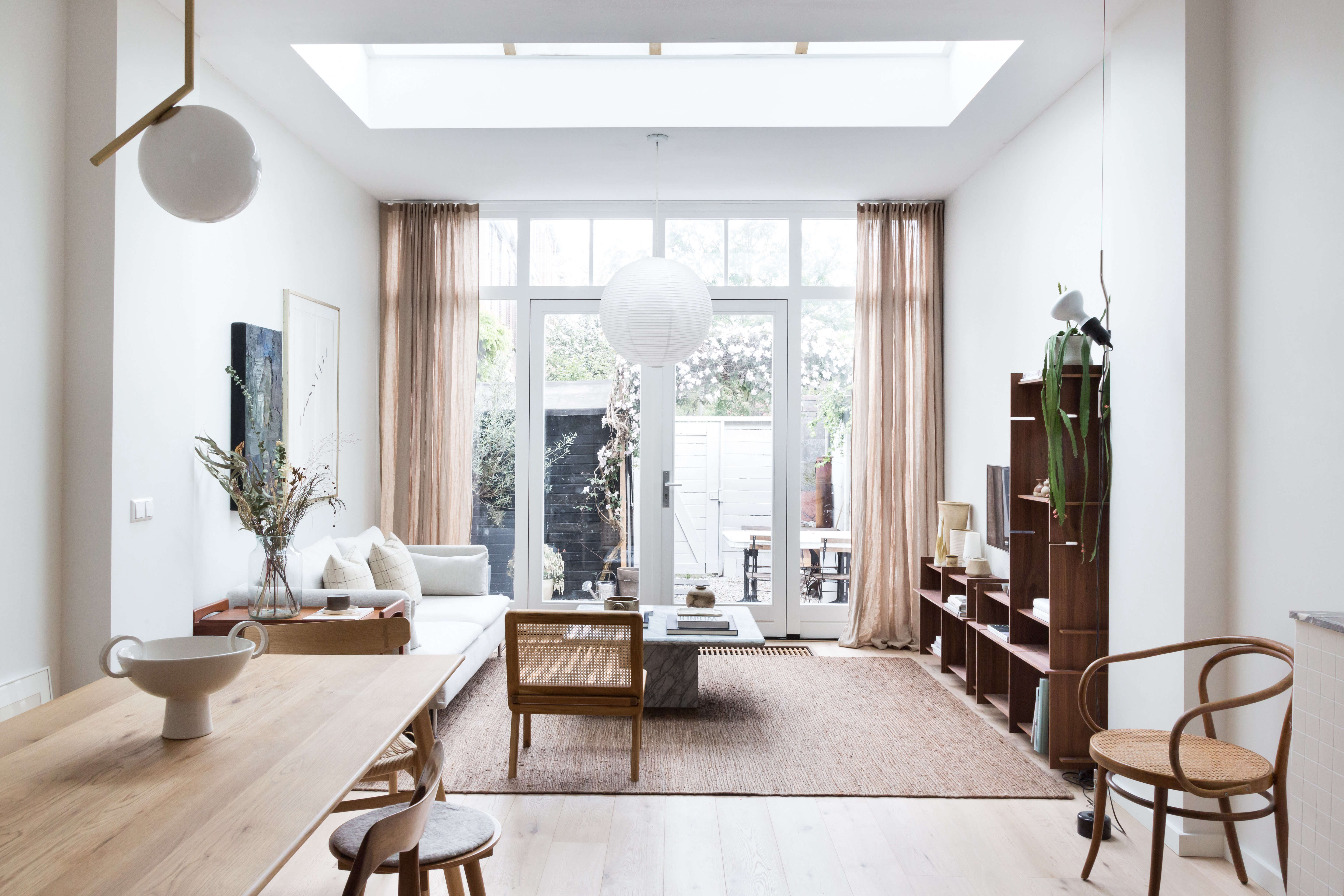
Some houses are loud. They shout with color, trend, and a suspicious number of decorative bowls. This Dutch family home does the opposite. It whispers. And somehow, that whisper is more powerful than a room screaming in avocado velvet and brass. In Delft, interior designer and photographer Holly Marder reworked her own 1929 row house into a place where texture, light, and daily family life finally stopped fighting each other and started acting like civilized adults.
The result is not flashy design for design’s sake. It is a home that proves a point many great interiors eventually learn: beauty lands harder when it feels effortless. This revamped house is compelling not because every inch is styled within an inch of its life, but because the design solves real problems. The original ground floor was narrow, dark, and short on flow. The renovation changed that with structural moves, better light, and a material palette that feels calm without being sleepy.
What makes this project especially interesting is that it belongs to someone trained to see space in two ways. As a designer, Marder understands layout, proportion, and function. As a photographer, she understands framing, shadow, softness, and what happens when daylight hits a textured surface at exactly the right hour. That double vision turns a family house into a lesson in how to make a home feel edited, layered, and lived in all at once.
A Dutch Row House with Better Bones Than First Impressions Suggested
The house itself had promise from the start. Like many older row houses, it offered character and height, but also the usual headaches: a cramped kitchen, limited living space, and a rear extension that had clearly seen better centuries, or at least better decades. Instead of trying to force a complete personality transplant, the redesign respected the original structure and then corrected what daily life was exposing as weak points.
That is one reason the renovation feels convincing. Good remodels do not erase the story of a house; they edit it. Here, the aim was not to turn a 1929 Dutch home into a sterile showroom. It was to create light, flow, and functionality for a growing family. That sounds simple, but in practice it means making hard decisions about what stays, what moves, and what finally gets kicked out of the floor plan like an unhelpful dinner guest.
Two moves changed everything: the staircase was reconfigured, and the back of the house was extended to bring in more light and create a more open living zone. Those choices did more than improve circulation. They transformed the emotional experience of the house. Suddenly, the narrow footprint read as elegant rather than restrictive. The downstairs became spacious enough to breathe in. And the home’s connection to the garden started to matter in a meaningful way.
Why Light Does the Heavy Lifting
If texture is the soul of this house, light is the ringleader. The renovation makes strategic use of French doors and a skylight so daylight reaches deeper into the plan. That matters in any home, but it matters even more in a long row house, where the center can easily become gloomy and forgotten. Nobody dreams of a “moody transitional hallway zone” when they buy a family home. They just end up with one unless the design intervenes.
What is striking here is that light is not treated as a bonus. It is the organizing principle. Rooms feel composed around how brightness moves across walls, floors, cabinetry, art, and objects. The house does not depend on visual clutter to feel rich because the changing quality of daylight creates variation all day long. Morning light can make pale surfaces feel crisp and optimistic. Afternoon light warms wood, ceramics, and woven materials. Evening softens edges and lets the rooms exhale.
That approach aligns with a larger truth repeated across strong American design coverage: people increasingly want homes that restore them, not overstimulate them. Natural light, organic materials, and quieter palettes show up again and again because they work. They make spaces feel larger, calmer, and more connected to the rhythms of real life. This Dutch house just happens to demonstrate that principle with remarkable grace.
Texture Instead of Noise
Minimal interiors often get accused of being cold, and frankly, some of them deserve it. A room stripped down to its bare essentials can look chic in a photograph and feel like a luxury waiting room in person. The difference here is texture. Instead of relying on busy pattern or high-contrast color to create interest, the house layers tactile materials and finishes so the rooms feel warm, nuanced, and deeply human.
The kitchen is a great example. Bamboo cabinetry introduces warmth and grain without visual chaos. A pale stone-like countertop brings softness and subtle contrast. Nearby ceramics, art, textiles, and natural finishes add depth in small increments. The palette stays disciplined, but it never turns flat. This is the kind of interior where beige does not behave like surrender. Beige behaves like strategy.
That strategy matters because texture catches light in ways flat surfaces cannot. Matte plastery walls, woven textiles, wood grain, stone, brushed finishes, and handmade objects all respond differently throughout the day. As a result, a restrained room can still feel alive. It is the old magic trick of making a neutral interior look expensive and soulful without shouting, “Please notice my imported statement chair!”
The High-Low Mix Makes It Livable
One of the smartest things about the house is its refusal to become precious. The rooms mix design-forward pieces with more accessible finds, including Ikea. That matters. It keeps the project grounded in reality and makes the beauty feel achievable rather than museum-grade. Family homes need this kind of balance. When every object is rarefied, the house can stop feeling like a home and start feeling like a hostage situation for red wine, crayons, and normal people.
The high-low mix also creates visual honesty. A home is more convincing when everything does not arrive from the same catalog on the same truck. Here, mid-century art, beloved ceramics, functional cabinetry, and practical furnishings all coexist without hierarchy anxiety. The result is curated but not uptight. Thoughtful but not smug. Elegant, yes, but still ready for children, guests, and the kind of Tuesday that involves laundry and toast crumbs.
A Photographer’s Eye Changes the Atmosphere
Designers plan spaces. Photographers read them. When the same person does both, something special can happen. This house benefits from a strong sense of composition: clear sightlines, balanced negative space, intentional contrast, and moments where objects are given room to breathe. Nothing appears randomly parked. Even the quieter corners feel considered.
That photographic sensibility shows up in the way the home stages pause. Not everything is filled. Not every wall has to perform. Not every shelf needs a personality disorder’s worth of accessories. The restraint allows individual materials to matter more. A linen curtain can be enough. A ceramic vessel can be enough. A chair against a soft wall with good daylight can do the work of ten frantic styling decisions.
This is also why the house feels calm. Calm is not an absence of things. Calm is the presence of order. The renovation understands proportion, shadow, and visual rhythm, which gives the interiors a subtle authority. You feel guided through the space without being bossed around by it.
The Kitchen as the Heart, Not the Bottleneck
Before the remodel, the kitchen was part of the problem. After it, the kitchen became the argument for the entire project. It is expansive, efficient, and visually integrated with the rest of the ground floor. Instead of operating like an isolated workstation, it now supports the social life of the home while still delivering serious storage and prep space.
This matters because family kitchens today are rarely only kitchens. They are breakfast bars, homework stations, coffee headquarters, mail traps, late-night snack arenas, and unofficial therapy offices. The best ones manage all of that while still looking intentional. The Delft house succeeds because the kitchen does not compete with the architecture. It extends it.
The cabinetry reads as calm and architectural. The surfaces are streamlined. The palette stays close to nature. And because the room is tied into the larger open-plan layout, it benefits from both borrowed light and shared atmosphere. There is no abrupt jump from “working zone” to “beautiful zone.” It is all one coherent environment.
Lessons for Anyone Renovating an Older Family Home
This house offers several practical takeaways for homeowners, especially those dealing with older homes that have charm but lousy circulation.
1. Fix the flow before buying more furniture
A better layout will improve a home more than a parade of expensive objects ever could. Reconfiguring the staircase and extension changed how this house worked on a daily basis. That is design at its most effective.
2. Use a restrained palette, then build richness through materials
When a color scheme is quiet, texture has room to perform. Wood, bamboo, stone, ceramics, linen, and other tactile materials create depth without clutter.
3. Let light guide decisions
Natural light should influence layout, surface choices, window treatments, and even art placement. A house that welcomes daylight will usually feel larger and more generous than one that depends on decorative tricks alone.
4. Keep it beautiful, but keep it believable
The most successful family homes are not anti-style. They are anti-fuss. Mixing investment pieces with practical finds creates character and flexibility. It also helps your house survive actual life.
Why This Revamped Netherlands House Resonates So Strongly
There are many beautiful homes online. Fewer feel emotionally legible. This one does. Maybe that is because the renovation is not about perfection. It is about alignment. The architecture, light, materials, and family routines all pull in the same direction. Nothing feels arbitrary. Nothing feels like it was chosen only to perform on social media for strangers named Madison and Brad who type “obsessed” under everything.
The house also captures a mood that resonates far beyond the Netherlands: a desire for homes that are softer, more tactile, and more grounding. After years of glossy sameness and algorithm-approved interiors, there is something refreshing about a project that values atmosphere over spectacle. It reminds us that luxury is not just marble and square footage. Sometimes luxury is a room that holds light beautifully at 8:15 a.m. while the coffee is brewing and the rest of the world has not yet started yelling.
Conclusion
Texture and light are not decorative afterthoughts in this Dutch family home. They are the framework. By opening up the ground floor, bringing daylight deeper into the plan, and leaning on layered natural materials instead of loud visual tricks, Holly Marder created a house that feels refined, restful, and highly functional. It is a designer’s home, yes, but more importantly, it is a family home that understands how people actually live.
That is what makes the renovation memorable. It proves that good design does not need to over-explain itself. It just needs to make life feel a little easier, a little calmer, and a lot more beautiful. In a world full of interiors trying very hard to be seen, this one wins by letting light, texture, and thoughtful restraint do the talking.
Extended Reflections: The Experience of Living with Texture and Light
The most interesting thing about a house like this is that its success is felt before it is analyzed. You notice it in the way you move through the rooms without hesitation. You notice it in the lack of visual friction. You notice it when a simple breakfast feels more grounded because the morning light lands softly on the table, the cabinetry, and the ceramics in a way that makes the whole house feel awake with you. A well-designed home changes routine from something endured into something quietly enjoyed.
In a textural, light-led interior, daily life tends to slow down in the best way. You become more aware of seasons, weather, and time of day because the house reflects them back to you. On gray mornings, the pale palette can feel cocooning rather than dreary. On bright afternoons, the materials come alive: stone looks cooler, wood warmer, linen softer, and handmade pieces more expressive. The rooms do not stay visually static. They evolve as the light evolves, which means the house keeps offering small moments of discovery without ever changing its basic identity.
There is also something deeply comforting about a home that relies on touch as much as sight. Smooth counters, woven fibers, matte walls, natural wood, and weighty ceramics all create a sense of presence. You do not just look at the room; you inhabit it. In many homes, visual impact comes from contrast and novelty. Here, impact comes from familiarity and nuance. The materials ask to be noticed gradually. That can be more lasting than instant drama because it rewards living, not just looking.
For families, this matters even more. A tactile, well-lit house tends to support real life with surprising generosity. Children can spread out, adults can cook without feeling isolated, and shared spaces can host both movement and rest. Open-plan living often gets criticized for becoming chaotic, but in a home like this, the calm palette and thoughtful zoning help everything hold together. There is room for conversation, room for work, room for mess, and room for recovery after the mess. Frankly, every house deserves at least that level of emotional maturity.
Another experience tied to this kind of design is the way objects begin to matter differently. In loud interiors, individual pieces can get lost in the noise. In quieter ones, a single vintage chair, a favorite bowl, or a much-loved artwork can take on real presence. You start editing more carefully. You bring fewer things in. You choose with more patience. The home teaches you its standards. Not in a snobby way, but in a “we already have enough random stuff, thanks” kind of way.
Perhaps that is the lasting appeal of this revamped Netherlands house. It does not simply look good in photographs, though it certainly does that. It models a way of living that many people are hungry for: less visual stress, more sensory depth; less trend-chasing, more permanence; less decorative performance, more atmosphere. A house built around texture and light can make ordinary life feel composed without making it feel staged. And that may be the most luxurious design move of all.