If there were ever a time for blue to have a main-character moment, this would be it. Crayola’s global color vote crowned Cerulean the favorite shade, and honestly? The public may have finally done something we can all agree on. Cerulean has that rare trick of feeling cheerful without being loud, calm without being sleepy, and polished without acting like it needs a trust fund. It is the kind of blue that looks like a clear-sky afternoon, a deep end at a very chic hotel, and the sort of paint swatch that makes you suddenly believe you could become “the type of person who owns linen curtains.”
In home design, that matters. Blue has long been one of the safest bets in the decorating universe, but Cerulean gives the category a little extra sparkle. It is brighter than navy, cleaner than teal, and less babyish than pale powder blue. In other words, it has range. You can use it to wake up a tired entryway, add confidence to a kitchen island, turn a bathroom into a tiny vacation, or bring a little life to a living room that currently feels like it only exists to hold mail.
This is not a suggestion to dunk your whole house in cartoon blue and hope for the best. The secret to using Cerulean well is understanding where it shines, what colors calm it down, and how to make it feel intentional instead of accidental. Once you get that balance right, this “world’s favorite hue” becomes surprisingly easy to live with.
Why Cerulean Works So Well at Home
Cerulean sits in a sweet spot between energetic and easygoing. It has the uplifting, fresh quality people love in sky tones, but it also brings enough depth to feel deliberate. That makes it useful for homeowners who want color without full chaos. It is blue with a pulse.
Design-wise, Cerulean works because it pulls from nature. It echoes open sky, clear water, summer light, and all those visual cues our brains tend to file under peaceful, pleasant, yes please. That natural connection helps the color feel friendly rather than fussy. It can read coastal, classic, modern, eclectic, playful, or even slightly preppy depending on what you pair it with.
It also solves a common decorating problem: how to add personality without making a room feel smaller or heavier. Dark blues are gorgeous, but they can lean dramatic fast. Pale blues are lovely, but they sometimes float away into “nice enough” territory. Cerulean offers a more balanced middle ground. It has enough saturation to make a statement, but enough brightness to keep a space feeling open.
What Cerulean Says About Your Style
Using Cerulean at home sends a very specific design message: you like color, but you still want your house to function like a house, not a theme park. This shade feels collected, happy, and a little adventurous. It suggests confidence without turning every room into a peacock impression.
That is why Cerulean works across so many styles. In a traditional space, it adds freshness to white millwork, warm wood, and brass hardware. In a modern room, it cuts through beige minimalism with a cleaner, sharper edge. In eclectic interiors, it plays well with patterns, art, rattan, lacquer, and vintage finds. In family homes, it has enough energy to feel lively but enough calm to avoid visual sugar overload.
If your style lives somewhere between “timeless” and “I do, in fact, want one fun thing,” Cerulean may be your color soulmate.
How to Use Cerulean in Your Home Without Overdoing It
1. Start with one architectural feature
If you are Cerulean-curious but not ready to hand your whole house over to a crayon, begin with a single feature. A painted front door, built-in bookcase, vanity, island, or accent wall lets you enjoy the color without overcommitting. Cerulean is especially good on millwork and cabinetry because its clean brightness makes those shapes pop.
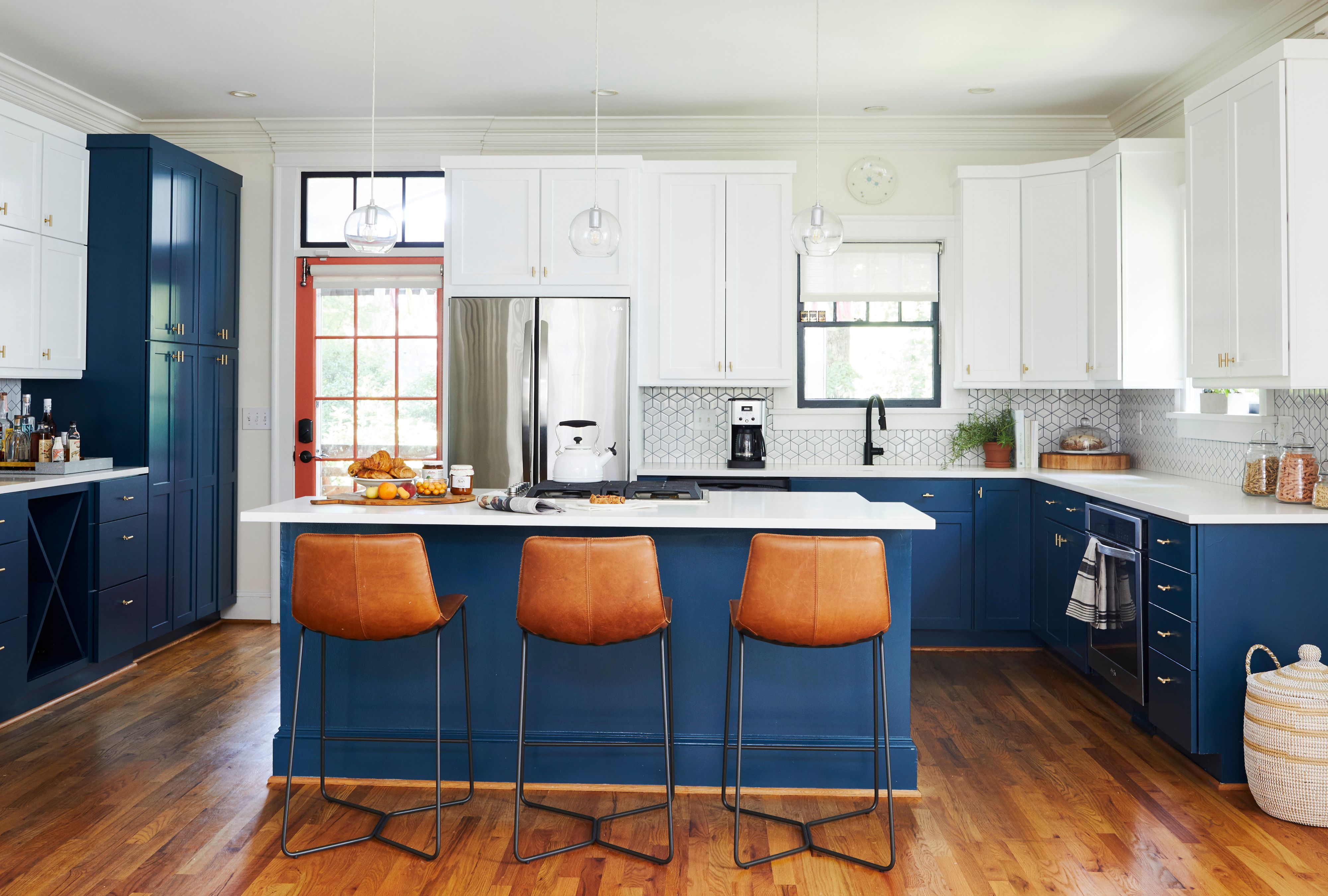
A front door in Cerulean feels welcoming and memorable. A hallway end wall painted Cerulean can add depth and draw the eye forward. A kitchen island in this shade instantly becomes the star of the room, especially when surrounded by white cabinets and warm wood stools. One controlled hit of color can do more than a room full of timid maybe-blue accessories.
2. Pair it with grounding neutrals
Cerulean loves a supporting cast that knows when to keep quiet. Crisp white makes it feel fresh and classic. Cream softens it. Warm taupe, sandy beige, camel, and oat tones keep it from tipping into chilly territory. If your room already has natural oak, walnut, jute, rattan, linen, leather, or stone, Cerulean usually slides right in.
This is a useful trick if you want the room to feel grown-up. Bright blue can go juvenile when it is surrounded by equally loud colors and synthetic finishes. But when you put it next to plaster, boucle, unlacquered brass, terracotta, marble, or wood, it suddenly looks expensive. Same blue. Better company.
3. Use contrast on purpose
Because Cerulean is vivid, it thrives on thoughtful contrast. One of the smartest ways to use it is to pair it with warm accents. Think rust, burnt orange, coral, terracotta, cognac leather, honey wood, or antique brass. These tones pull out Cerulean’s sunny side and stop the room from feeling too cool.
This is where the color becomes especially fun. A Cerulean sofa with rust velvet pillows feels lively and sophisticated. A Cerulean powder room with brass sconces feels glamorous. A Cerulean breakfast nook with cane chairs and a walnut table feels bright but grounded. The contrast keeps everything from flattening into one long blue sentence.
4. Repeat the color in small doses
Once you introduce Cerulean, echo it lightly around the room so it looks intentional. That could mean a painted lamp base, a stripe in a rug, a vase, a pillow, art matting, or a patterned curtain with a hint of the same tone. Repetition creates rhythm. Rhythm creates polish. Polish makes people think you absolutely meant to do this, even if the whole plan started with one impulsive paint sample taped to the wall for six days.
The Best Rooms for Cerulean
Living rooms
Cerulean can make a living room feel brighter, friendlier, and more layered. If you want a bold move, try it on walls balanced by cream upholstery, wood furniture, and black or brass accents. If that feels like a lot, bring it in through drapery, a rug, painted shelving, or a pair of upholstered chairs. It is especially effective in rooms that need energy but still need to feel restful.
Bedrooms
Blue is a classic bedroom shade for a reason, and Cerulean gives that tradition a fresher twist. Used behind a headboard, on trim, or on a single wall, it feels calm with a touch of optimism. Pair it with white bedding, natural linen, pale oak, or soft gray if you want a breezy retreat. Add camel, rust, or aubergine if you want something moodier and more cocoon-like.
Bathrooms
This might be Cerulean’s easiest win. Blue already feels at home around water, tile, mirrors, and morning light. A Cerulean vanity, painted beadboard, patterned wallpaper, or glossy zellige-style tile can turn an ordinary bathroom into a high-style space without requiring a complete renovation. Add white walls and brass hardware, and suddenly your bathroom is giving boutique hotel energy on a very un-boutique budget.
Kitchens
Cerulean works beautifully in kitchens when used with restraint. It is perfect for lower cabinets, an island, pantry doors, or bar stools. Against marble, butcher block, or white backsplash tile, it feels bright and clean. If you want a more European, collected look, combine it with creamy cabinetry, warm wood, and aged brass. The result is cheerful, practical, and just a little bit smug in the best way.
Entryways and hallways
These transitional spaces are ideal for stronger color because you do not sit in them all day. A Cerulean hallway ceiling, a painted console, or a statement wall in an entry can set the tone for the whole house. It says, “Welcome, this home has a personality,” without immediately shouting all of its opinions.
What Colors Go Best with Cerulean?
If you want Cerulean to look timeless instead of trendy, pair it thoughtfully. The best combinations usually fall into four categories.
Cerulean + white
This is the cleanest, crispest version. It feels classic, airy, and almost impossible to mess up. Great for kitchens, bathrooms, trim details, and coastal-inspired rooms.
Cerulean + cream + wood
This combination softens the color and makes it feel warm, relaxed, and lived-in. It is perfect for family rooms, bedrooms, and homes that lean natural or traditional.
Cerulean + rust or terracotta
This pairing has charm, depth, and a little swagger. It works well in living rooms, dining rooms, and spaces where you want blue to feel sophisticated rather than beachy.
Cerulean + green + coral
This is the bolder route. It can be gorgeous in eclectic interiors, kids’ spaces, creative studios, and anywhere you want a playful palette. The key is to anchor it with neutrals so it still feels edited.
Common Mistakes to Avoid
Using too much of it too fast. Cerulean is not shy. If you splash it on every wall, every textile, and every accessory at once, the room can start to feel noisy. Let it have breathing room.
Ignoring undertones. Some Cerulean-adjacent paints lean greener, others grayer, and some verge on cobalt. Always test before committing. What looks like “bright sky blue” in one room can become “surprise tropical sports drink” in another.
Forgetting lighting. In strong natural light, Cerulean glows. In dim rooms, it can deepen and cool off. That is not bad, but it does mean you should sample it morning, afternoon, and evening before handing over your weekends to a paint roller.
Skipping texture. Blue rooms feel best when they have tactile variety. Linen, wood, cane, plaster, leather, wool, and brushed metal keep Cerulean from looking flat or synthetic. Texture is what makes color feel layered instead of loud.
If You Rent, You Can Still Use It
Not everyone can paint their cabinets and install tile like they are on their third renovation show. The good news is Cerulean is just as effective in renter-friendly form. Try pillows, throw blankets, art, lampshades, trays, side tables, peel-and-stick wallpaper, shower curtains, bedding, or a statement rug. One Cerulean accent can wake up a bland room in seconds.
A large piece of art with Cerulean tones can set an entire palette. So can a striped rug, a ceramic lamp, or a velvet chair. The trick is to use enough of the color that it reads as intentional, but not so much that your living room starts to resemble a giant pool float.
What Living with Cerulean Actually Feels Like: Real-World Design Experiences
In real homes, Cerulean tends to create the kind of reactions people remember. Picture an entryway that used to be forgettable: beige walls, dark shoe tray, one sad mirror. Add a Cerulean console and suddenly the whole space wakes up. Guests notice it right away. The room feels brighter even before anyone changes the lighting. It reads cheerful, but not childish. It feels like the homeowner made a decision instead of merely inheriting a default.
Now imagine a small bathroom with no window and all the personality of a paper towel. This is where Cerulean can pull off one of its best tricks. On a vanity or lower wall treatment, the color creates a sense of freshness that white alone cannot deliver. Instead of feeling sterile, the room starts to feel clean in a luxurious way. Add brass hardware and a fluffy white towel, and suddenly the everyday routine of brushing your teeth feels suspiciously close to a boutique hotel stay. That is the thing about good blue: it improves the mood of ordinary moments.
Bedrooms are another place where people often discover Cerulean is more flexible than expected. Someone may worry that blue will feel too cold or too playful, but once it is paired with creamy bedding, woven textures, and warm wood tones, the room shifts. It becomes restful without turning sleepy, uplifting without being loud. In morning light, Cerulean can feel fresh and airy. At night, under softer lamps, it settles into something gentler and cocoon-like. That day-to-night adaptability is part of why people keep returning to blue in the first place.
Family rooms offer a different experience. Here, Cerulean often works best when it shows up in parts rather than everywhere. Maybe it is a rug with blue woven through it, a lacquered side table, a set of patterned pillows, or built-ins painted in a lively midtone shade. What people tend to notice is that the room feels more awake. Neutral furniture suddenly has a pulse. Wood floors look richer. Plants look greener. Even black accents look sharper. Cerulean acts a little like a good soundtrack: it does not have to dominate the whole scene to change the energy of it.
And then there is the emotional side of the color, which is harder to measure but easy to recognize. Many people associate Cerulean with something expansive: sky, water, vacation, clarity, breathing room. When it appears in a home, it can subtly nudge a room away from feeling closed-in or flat. That does not mean every Cerulean room becomes magical overnight. There is still laundry. There are still tangled cords. There is still at least one chair wearing clothes. But the color has a way of making a home feel more considered, more open, and a little more alive. Sometimes that is exactly what a room needsnot a dramatic overhaul, just one beautiful blue note played in the right place.
Final Take
Cerulean did not become the world’s favorite shade by accident. It hits the sweet spot people are always chasing in design: uplifting but calming, bold but livable, classic but not boring. It works in grand gestures and tiny accents. It plays well with white, cream, wood, brass, coral, green, and rust. It can freshen a tired room, sharpen a neutral palette, or give a home just enough personality to feel memorable.
So yes, Crayola may have started the conversation, but the real reason Cerulean matters is what it does once it enters a room. It brightens. It balances. It behaves surprisingly well for such a charming show-off. And in a world full of beige-on-beige decorating advice, that feels like a very welcome splash of blue.