If your onboarding feels like handing new users a map written in invisible ink, a checklist can fix that. Not by magically making your product simpler, unfortunately. If only software worked like that. But a well-built checklist in Userpilot can make the path to value clearer, faster, and a whole lot less stressful for new users.
Userpilot lets product teams create in-app checklists that guide users through meaningful actions inside the product. Instead of dumping people into your app and hoping they “click around and vibe,” you can point them toward the exact steps that matter: complete setup, explore a key feature, invite a teammate, or finish a first workflow. Done right, a checklist becomes part onboarding coach, part progress tracker, and part motivational nudge.
In this guide, you’ll learn how to create and publish a checklist in Userpilot, how to target the right users, how to test it before launch, and how to measure whether it is actually helping people move forward. We’ll also cover practical checklist design tips so you do not create a tiny in-app to-do list that users ignore with Olympic-level confidence.
Why use a checklist in Userpilot at all?
A checklist works because it turns an abstract onboarding experience into a visible series of next steps. That matters. New users usually do not need a grand tour of every button your team has lovingly shipped over the past three years. They need direction. They need momentum. And they need to feel like they are making progress.
That is exactly where Userpilot checklists shine. Inside the platform, a checklist is built as a sequence of tasks that can send users to a page, trigger a flow, run a script, or simply mark the task complete when clicked. In other words, it is not just a static list. It is an action layer inside your product.
That makes checklists especially useful for:
- new user onboarding
- feature adoption campaigns
- secondary onboarding for underused features
- trial activation flows
- self-serve product education
Broadly speaking, the best onboarding experiences help users reach an “aha” moment quickly, reduce cognitive overload, and present steps in a logical order. A checklist supports all three goals when it is focused, well-targeted, and tied to real user outcomes instead of random product trivia.
Before you create the checklist, decide what success looks like
Before you click anything inside Userpilot, define the one outcome your checklist is supposed to drive. Not five outcomes. Not seventeen “nice-to-haves.” One.
For example, your goal might be:
- publish the user’s first project
- connect a data source
- invite two teammates
- create a first report
- finish account setup
This matters because a checklist should guide users to value, not just movement. Plenty of products accidentally create “busywork onboarding” where users complete tasks but still do not understand why the product matters. That is the software equivalent of assembling Ikea furniture without getting the bookshelf.
A strong checklist usually has a few traits:
- It focuses on essential tasks, not every possible feature.
- It follows the user’s natural journey from basic to more advanced.
- Each task leads to a meaningful action.
- The copy is short, concrete, and outcome-driven.
If you can describe why each task exists in one sentence, you are on the right track. If you need a committee, a spreadsheet, and a snack break to justify a task, that task probably does not belong there.
How to create a checklist in Userpilot
1. Open the checklist builder
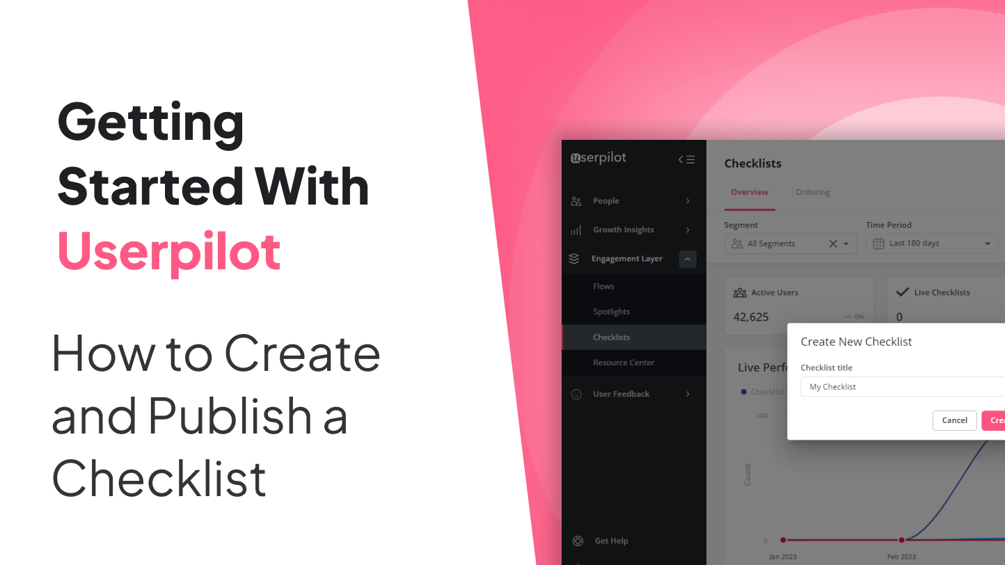
In Userpilot, go to Engagement > Checklists from the sidebar, then click Create Checklist. Give the checklist a clear title so your team can recognize it later. This title is for internal organization, but it is worth naming well because checklists pile up fast in growing SaaS teams.
A naming format like Trial Onboarding – First Report or New Admin Setup – Workspace Launch keeps things far cleaner than naming everything “Checklist 4 final FINAL use this one.”
2. Add tasks in the Tasks tab
The first stage of building your checklist is adding tasks. Userpilot allows several task actions, and each one serves a different job:
- Do nothing: the task marks complete when clicked.
- Go to page: sends the user to a specific URL.
- Trigger a flow: launches a Userpilot flow from the checklist task.
- Run script: runs a JavaScript function when the task is clicked.
This flexibility is the difference between a checklist that merely exists and one that actively moves the user forward. A “Go to page” task can get users to the right place. A “Trigger a flow” task can explain what to do once they arrive. A “Run script” task can support more custom product behaviors. And “Do nothing” works when the task is more like a quick acknowledgment step.
Userpilot also allows up to 15 tasks per checklist, but that is a ceiling, not a dare. In most cases, fewer is better. A tight checklist with four to seven high-value actions will usually outperform a bloated one that looks like a semester syllabus.
Here is a simple example for a B2B SaaS product:
- Create your workspace
- Connect your first integration
- Invite a teammate
- Build your first dashboard
- Share a report
Notice what these tasks have in common: they are specific, sequential, and tied to activation. They do not say things like “Explore navigation” or “Check out settings” because nobody wakes up hoping to explore navigation.
3. Use practical task copy
The best checklist copy sounds like a helpful product coach, not a robot reading release notes. Start each task with a verb. Keep it short. Make the payoff obvious.
Good examples:
- Connect your calendar
- Import your first contact list
- Create your first automated report
Weaker examples:
- Calendar integration settings
- Contacts functionality
- Reporting module overview
Users are not trying to admire your information architecture. They are trying to get something done.
How to style your Userpilot checklist
Once your tasks are in place, move to the Style tab. This is where you make the checklist feel like it belongs inside your product rather than crashing the party uninvited.
Widget settings
Userpilot gives you control over the checklist widget itself, including:
- header and subtitle
- theme selection
- colors and icons
- text font and text colors
- minimize button styling
- dismiss behavior
- completion message, description, and button text
This is not just decoration. Design choices affect usability. A clear header tells users why the checklist exists. A smart completion state gives them closure. And a thoughtful dismiss option prevents the widget from becoming that one guest who refuses to leave the kitchen.
Beacon settings
Userpilot also lets you style the collapsed checklist beacon. You can control the icon style, background color, label, font color, corner radius, position, and z-index. If your checklist is not auto-opened, the beacon matters a lot because it is the part users will actually notice first.
A good beacon label is simple and inviting: Get Started, Setup Guide, or Next Steps. A bad beacon label sounds like internal jargon your product team invented after three coffees.
One practical limitation to remember: only one checklist can be triggered on the same page at the same time. If you need multiple guided resources available at once, Userpilot allows you to surface another checklist through a Resource Center module instead.
How to target the checklist correctly
Even a beautifully designed checklist will flop if it appears for the wrong users, on the wrong page, at the wrong time. Relevance is half the battle.
Domain targeting
Userpilot lets you show the checklist on all domains with the snippet installed or only on specific domains and subdomains. This is particularly useful if your product uses separate staging, app, or admin environments.
Page targeting
You can display the checklist on any page or restrict it to specific URL paths. For dynamic URL structures, Userpilot supports regex-style matching so you can account for changing URL segments without rebuilding your targeting every time your app gets dramatic.
Audience targeting
This is where your checklist becomes genuinely useful instead of generally visible. Show the checklist to the exact segment that needs it: brand-new trial users, admins, first-time collaborators, under-engaged accounts, or users who adopted feature A but not feature B.
The more specific your audience, the more natural the checklist feels. Personalization is not just a conversion buzzword. It is the difference between “Oh, helpful” and “Why is this here?”
Trigger options
Userpilot supports more than one way to trigger a checklist. Beyond standard display behavior, you can trigger it manually through:
- other Userpilot content
- a shareable permalink
- JavaScript
You can also use CSS selectors for certain trigger configurations if you want the checklist to open from a particular element in your app. That gives teams more control when the checklist should appear in a highly contextual moment rather than immediately on page load.
How to test a checklist before publishing
Testing matters. A lot. Because nothing says “welcome to our polished product experience” like a checklist launching on the wrong page, covering a key button, and targeting your CEO by accident.
Userpilot provides a few smart testing options:
- Only me and colleagues: useful when you want internal testing through the Chrome extension.
- Testing or staging environment: good for validating behavior outside production.
- Specific users: ideal for controlled tests with internal or beta users.
During testing, check the following:
- Does the checklist appear on the correct page?
- Does it obey your audience rules?
- Does the beacon sit in a sensible place?
- Do task actions lead where they should?
- Does the checklist feel too long, too vague, or too aggressive?
Userpilot also notes that manual triggering through a permalink or JavaScript can be useful when you want to test how the checklist looks and behaves without publishing it broadly to end users.
How to publish a checklist in Userpilot
Once the checklist looks right and behaves correctly, update the targeting settings so the intended users can see it, then click Publish.
That is the technical part. The strategic part is making sure the checklist is launching at the right moment in the user journey. Publishing is not just flipping a switch. It is deciding when the checklist becomes useful enough to deserve screen space.
In many products, the best time to show a checklist is right after signup, first login, or completion of a welcome survey. In other products, it makes more sense after the user has chosen a role, connected a tool, or landed on a setup page. Timing should follow intent.
How to measure checklist performance after launch
Publishing a checklist is not the finish line. It is the start of the evidence phase.
In Userpilot’s checklist overview and analytics area, you can review data such as:
- status
- target users
- target page
- shown
- completed
- dismissed
- last clicked
- published time and other creation details
For individual checklist performance, Userpilot lets you drill into analytics with filters for segment and time period. The core metrics include:
- Started: how many times the checklist was viewed after loading
- Completed: how many users completed all tasks
- Dismissed: how often users closed it before finishing
You can also inspect performance trends and task-level breakdowns to see where users drop off. This is incredibly useful. A weak completion rate does not always mean the checklist is bad. Sometimes it means one task is confusing, one trigger is mistimed, or one step asks too much too soon.
If a checklist gets plenty of views but poor completion, ask:
- Are the tasks in the wrong order?
- Is one task too difficult?
- Is the checklist appearing before users are ready?
- Does the copy explain the benefit clearly enough?
- Should one task open a flow for more guidance?
Great teams do not publish and disappear. They publish, watch, adjust, and improve.
Checklist best practices that make a real difference
Start with foundational actions
Users should not be asked to do advanced tasks before basic setup is complete. A checklist should mirror the user journey, beginning with the simplest and most essential steps.
Do not hide core actions
If a task is truly central to product value, make the next step obvious. Users should not have to hunt through your interface like contestants on a low-budget treasure show.
Pair checklists with guidance
A checklist is strongest when combined with flows, contextual help, and self-service content. If a step is unfamiliar or slightly complex, connect the task to a flow or supporting help resource rather than assuming users will figure it out from sheer optimism.
Keep the list short
Shorter checklists feel finishable. Finishable checklists get completed. Completed checklists drive momentum. Momentum creates adoption. This is one of those rare product truths that does not require a giant conference keynote.
Review and maintain it
Your product changes. Your onboarding should too. Revisit live checklists regularly, especially after UI updates, navigation changes, new pricing tiers, or major feature launches.
Example: a simple Userpilot checklist for a reporting tool
Imagine you run a SaaS analytics platform. Your activation point is when a new user creates and shares their first dashboard. A practical checklist might look like this:
- Connect your data source Go to page
- Create your first chart Trigger a flow
- Build a dashboard Go to page
- Invite a teammate Go to page
- Share your first report Trigger a flow
This works because each task brings the user closer to the moment where the product becomes useful in a real-world workflow. It is not about “learning the software.” It is about getting value from the software.
Experiences from teams creating and publishing their first Userpilot checklist
Here is the part many teams discover after launch: the first version of a checklist is usually too ambitious. Someone always wants to include setup, education, upsell prompts, feature tours, community links, and maybe a small parade. Resist that urge. The best checklists feel narrow on purpose.
In practice, teams often learn that users respond much better to concrete tasks than to feature names. “Invite your team” beats “Collaboration tools.” “Create your first template” beats “Template center overview.” The more the task sounds like a real action with a real benefit, the less mental friction it creates.
Another common lesson is timing. A checklist shown too early can feel pushy. A checklist shown too late feels irrelevant. Teams often see better engagement when the checklist appears after a user has completed a welcome survey, selected a use case, or landed on the main workspace for the first time. That tiny bit of context changes everything. Suddenly the checklist feels like guidance, not interruption.
There is also a huge difference between a checklist that only links to pages and one that occasionally launches a flow. When a task points users to a more complex area of the product, adding a flow can dramatically reduce hesitation. It is the difference between saying, “Go over there,” and saying, “Go over there, and here is exactly what to do next.” Users generally prefer the second option, mostly because they are human.
Teams also learn fast that internal testing is not optional. A checklist that looks perfect in the editor can behave differently in the live product because of modals, sticky headers, custom layouts, or odd page states. Testing with real user paths, real screen sizes, and a few skeptical coworkers catches issues that polished screenshots never will.
Analytics usually reveal one surprising truth: low completion is often caused by one bad task, not the whole checklist. Maybe the third step is unclear. Maybe the fifth step asks for a permission users do not have yet. Maybe a task sounds easy but actually drops users into a confusing screen. Once teams start reviewing task-level performance, the checklist becomes much easier to improve.
Another experience worth mentioning is that dismissed checklists are not always failures. Sometimes users close them because they already know what to do. Sometimes they return later through the beacon. What matters is the pattern. If users start the checklist, finish core actions elsewhere, and still activate successfully, your onboarding may be working even if the checklist is not the star of the show.
Over time, the best teams stop treating the checklist as a one-time asset and start treating it like a living onboarding surface. They update copy, reorder tasks, swap in flows, change targeting, and revisit completion behavior as the product evolves. That mindset is what turns a decent Userpilot checklist into a reliable adoption tool.
Final thoughts
Creating and publishing a checklist in Userpilot is not difficult from a technical perspective. The platform makes the mechanics fairly straightforward: create the checklist, add tasks, style it, target it, test it, publish it, and watch the analytics.
The harder and more important part is strategy. Choose the right activation goal. Keep the checklist focused. Use task actions intentionally. Show it to the right audience at the right moment. Then keep improving it based on real usage.
Do that, and your Userpilot checklist becomes more than an onboarding accessory. It becomes a practical, measurable system for helping users succeed faster inside your product. Which, to be honest, is a much better use of everyone’s time than hoping they click the correct button by fate alone.